DESCRIPTIVE STATISTICS
STATISTICS: MAKING SENSE OF YOUR DATA
Science does not end when the data is collected. In many respects, that is where the real work begins. A researcher might have spent weeks designing a study, recruiting participants, and carefully controlling every variable they can think of, only to find themselves staring at columns of numbers with no immediate sense of what they mean. Raw data, however carefully gathered, does not interpret itself. It needs to be interrogated, organised, and examined systematically, and the discipline that provides the tools for doing this is statistics. Statistics provides the tools for determining what the results mean. They can be divided into two broad categories: descriptive statistics and inferential statistics.
DESCRIPTIVE STATISTICS: Descriptive statistics organise the raw data generated from a study into a readable form. Their purpose is to reveal patterns within the results. Ultimately, however, they help researchers answer a simple question: Did the study work? Was there a difference between the conditions? Descriptive statistics help researchers identify and display these patterns by examining the averages and spread of the data.
INFERENTIAL STATISTICS: Inferential statistics address a different question. Once the results have been analysed using descriptive statistics, researchers need to determine whether the observed difference is likely to recur or is simply a one-off due to chance. Inferential statistics help answer this question by calculating the probability of obtaining the observed result if chance alone were operating.
WHY DESCRIPTIVE STATISTICS COME BEFORE INFERENTIAL STATISTICS: The distinction is therefore straightforward. Descriptive statistics tell us what happened in the study. Inferential statistics help us determine whether the observed result is likely to be due to chance. For this reason, descriptive statistics always come first. Before researchers can determine whether a result is statistically significant, they must first examine the data and establish what pattern of results emerged. The following exercise demonstrates why descriptive statistics are integral.
DESCRIPTIVE STATISTICS RESEARCH SCENARIO
Before delving into the full explanation of descriptive statistics and its subsections, it is better to first understand why they are needed — what their purpose is and what they can and cannot tell us about the data. This is best demonstrated by walking through the results section of an experiment. Once the objective of that task has been understood, the particulars of all the different kinds of descriptive statistics can be explored
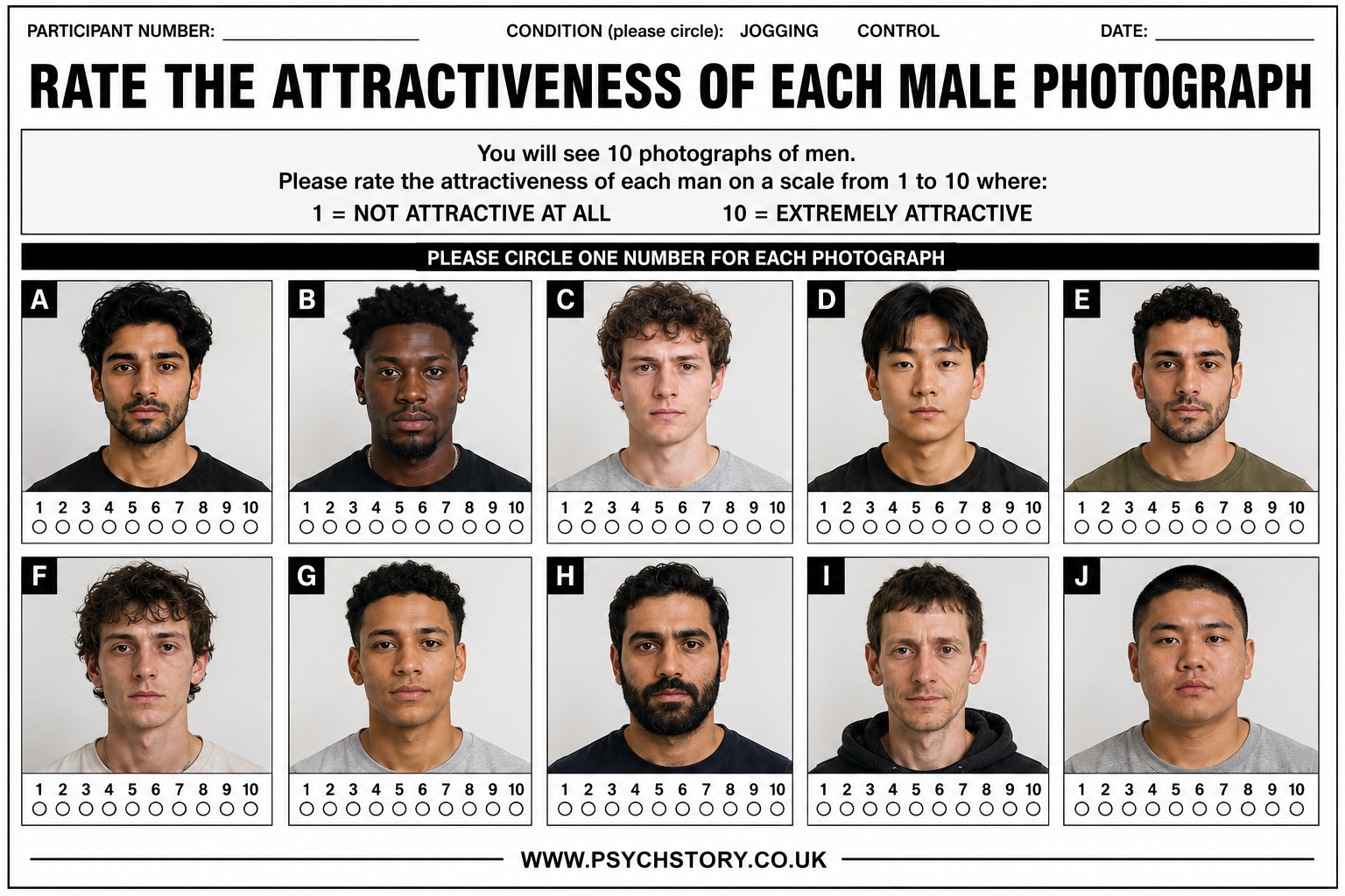
RATINGS OF THE OPPOSITE SEX FROM JOGGERS AND NON-JOGGERS
This study investigates whether prior physical activity influences how people perceive others' attractiveness. It is hypothesises that because both attraction and physical activity cause sympathetic arousal, participants that jog will be primed to find participants more attractive.
Participants were randomly allocated to one of two conditions before rating photographs of the opposite sex on an attractiveness scale of 1 to 10. In the jogging condition, participants jogged in place for 10 minutes before providing their ratings. In the control condition, participants undertook no exercise before rating the photographs. This design allows for a direct comparison of attractiveness ratings between physically active and inactive participants, with random allocation ensuring any differences observed can be more confidently attributed to the exercise manipulation rather than pre-existing group differences
HYPOTHESIS
Female participants who jog for 10 minutes will give significantly higher attractiveness ratings to photograpghs of the opposite sexthan participants who do not exercise beforehand. (directional/ 1-tailed)
EYEBALL TEST ACTIVITY
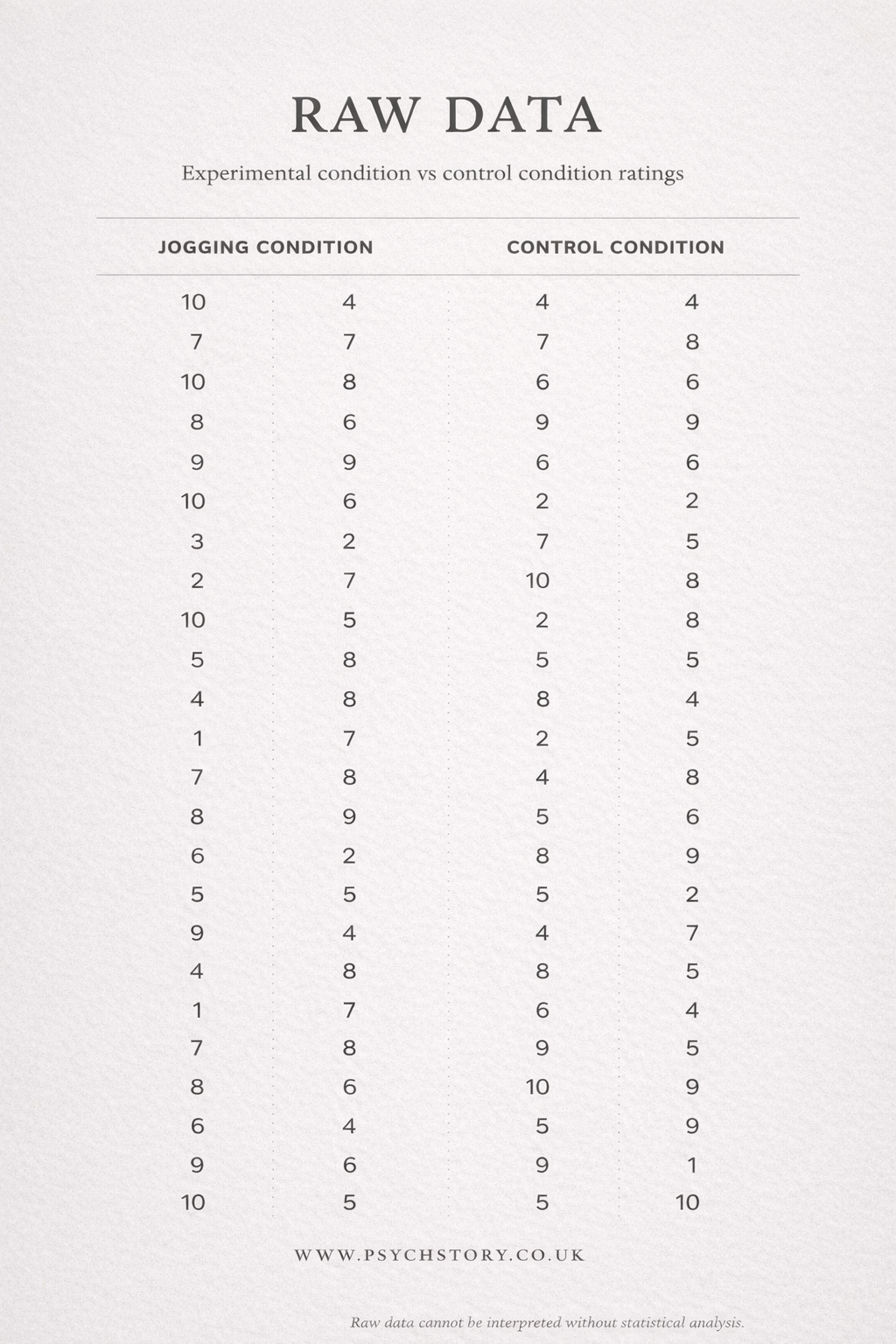
Below is the raw data collected from the experiment. Your task is to look at the table and, without doing any calculations, try to determine whether the jogging condition produced higher attractiveness ratings than the control condition. This is known as the eyeball test.
Then the table appears, followed by:
Did the 10 minutes of jogging make participants rate the photos as more attractive? Based on your scan of the data, decide:
The jogging condition performed better.
The control condition performed better.
It is impossible to tell which condition performed better
WHY THE EYEBALL TEST IS NOT ENOUGH
So, what did you choose?
If you chose option 1 or option 2, think carefully. You have just attempted to compare two sets of over 20 scores each using nothing but your eyes. We know from working memory that our capacity to process information simultaneously is limited, and scanning across 40 scores pushes well beyond that limit. The variability within each condition alone is enough to make any reliable comparison between the two groups virtually impossible without some form of summary
If you chose option 3, you are correct. It is impossible to tell which condition did better. Raw data is unreadable; there are simply too many numbers to make comparisons. Moreover, the example data set above has a small sample size; in reality, experiments can involve multiple conditions with hundreds of participants, making the task infinitely harder than the one you just attempted.
So how do researchers actually read raw data?
That is where descriptive statistics come in.
INTRODUCTION TO DESCRIPTIVE STATISTICS
Once raw data has been collected, researchers need to make sense of it. At this stage, the question is simple: did the experiment work? Not in the statistical sense of whether the results occurred by chance, that comes later with inferential statistics, but in the more immediate sense of whether the sample behaved in the way the researcher predicted. Descriptive statistics help answer this question by summarising large amounts of data into a form that is easier to understand and interpret. Rather than examining dozens or even hundreds of individual scores, researchers use descriptive statistics to identify overall patterns within the data.
AVERAGES
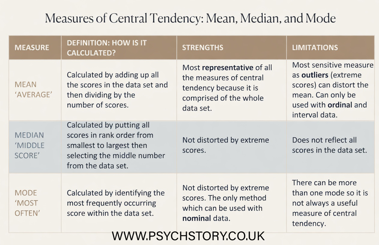
One way this is achieved is by using averages. Most students will already be familiar with averages from school, where they may have calculated the mean, median, and mode of a data set. In psychology and other scientific disciplines, however, these averages are more formally referred to as measures of central tendency. This term reflects their shared purpose: each attempts to identify the centre of a score distribution.
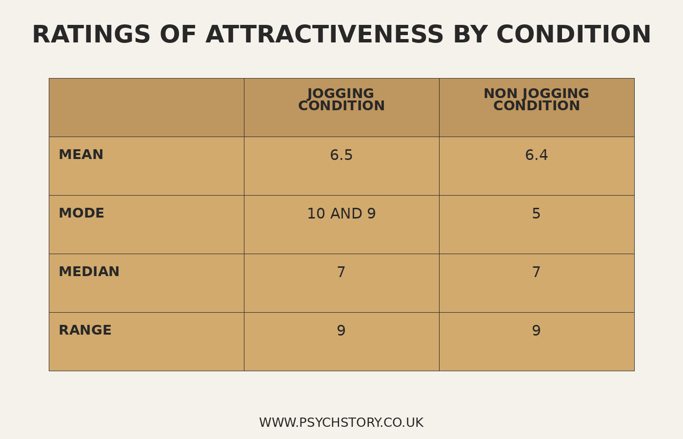
Most students will already be familiar with averages from school, where they may have calculated the mean, median and mode of a set of scores. In psychology, however, these are more formally referred to as measures of central tendency. Researchers use this term because the mean, median and mode are all designed to identify the centre of a distribution of scores. In other words, they indicate where the data tend to be centred overall. To see why this is useful, consider the jogging condition in the raw data table. The scores include 10, 7, 10, 8, 9, 10, 3, 2 and so on. Individually, these numbers tell us very little. We can see both high and low ratings, but it is difficult to judge the overall pattern from a long list of scores. By calculating a measure of central tendency, the researcher can identify the central point of the data. Instead of focusing on dozens of individual ratings, attention can be directed towards a single value that summarises the scores' centre. This makes it much easier to compare one condition with another and determine whether a meaningful difference appears to exist
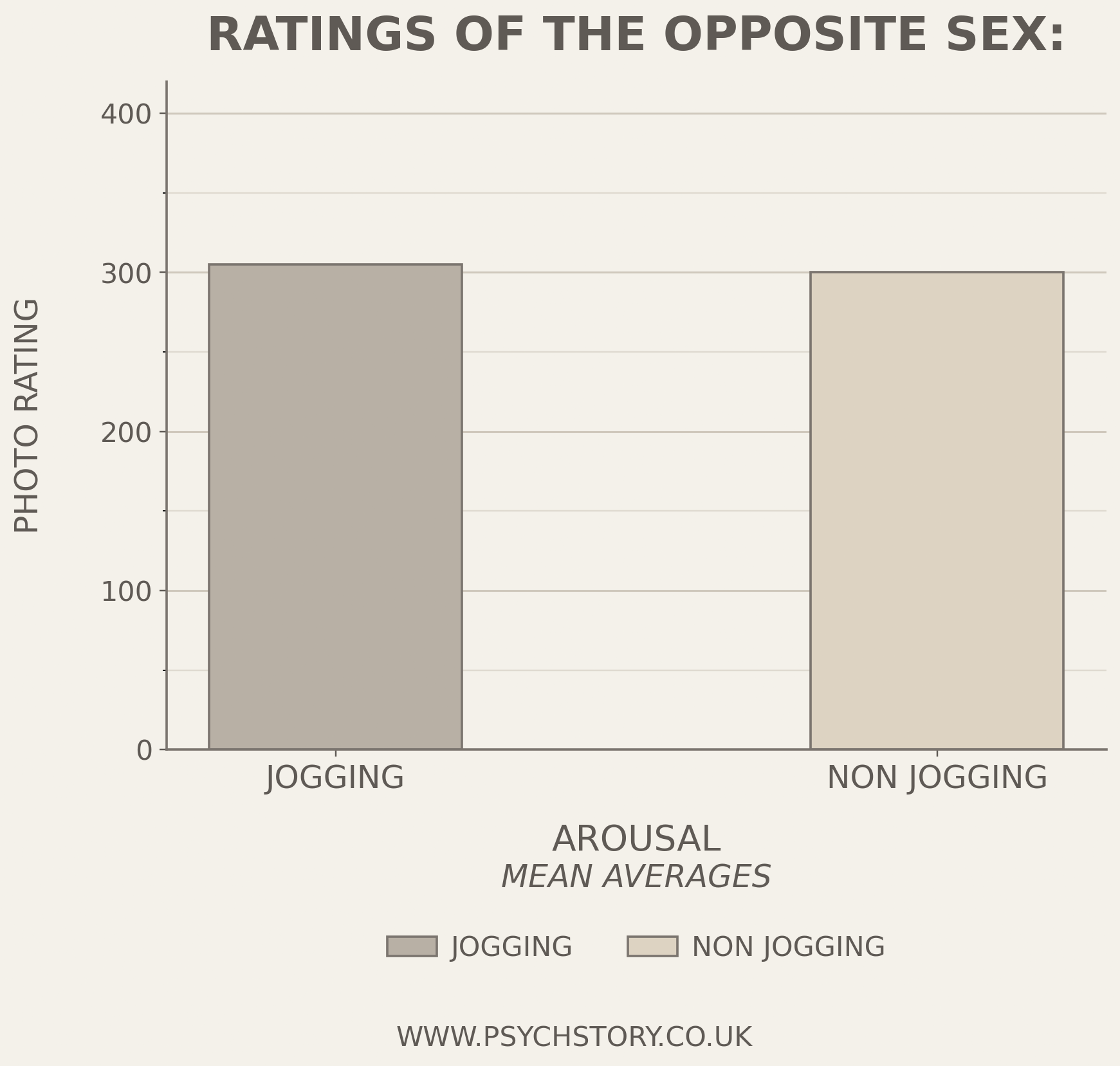
NOW LOOK AT THE NEXT TWO IMAGES BELOW (GRAPH 1 AND THEN TABLE 1)
Q: Question: Given the information presented in Graph 1, is it appropriate to conclude whether the study has succeeded at this research stage?
GRAPH 1: RATINGS OF THE OPPOSITE SEX: JOGGERS V NON-JOGGERS
DATA SPREADS
The second type of measurement is something students may not have encountered before. Whereas measures of central tendency tell us where the centre of the data lies, measures of dispersion tell us how spread out the scores are around that centre. This distinction is important because two groups can have exactly the same mean, median or mode but still be very different. Imagine two classes sitting the same test and both achieving a mean score of 70%. At first glance, the classes appear identical. However, consider the following results:
Class A: 68, 69, 70, 70, 71, 72
Class B: 20, 50, 70, 70, 90, 120
Both classes have a mean score of 70, yet the pattern of scores is clearly very different. In Class A, the scores are tightly clustered around the mean. In Class B, the scores are spread much more widely. Measures of central tendency tell us that both classes have the same centre, but they tell us nothing about the spread of scores. Measures of dispersion allow researchers to examine this spread or variability within the data. Rather than asking, "Where is the centre of the scores?", they ask, "How far apart are the scores?" The greater the spread, the more variation there is among participants. The smaller the spread, the more similar participants are to one another.
In psychology, the simplest measure of dispersion is the range. The range is calculated by subtracting the lowest score from the highest score.
Using the examples above:
CLASS A:
Highest score = 72, Lowest score = 68
Range = 72 − 68 = 4
CLASS B:
Highest score = 120, Lowest score = 20
Range = 120 − 20 = 100
Although both classes have the same mean score, Class B has a much larger range, indicating far greater variability between students. Returning to the jogging study, two groups might produce very similar mean attractiveness ratings, yet one group may contain much greater variation in individual responses. For example:
JOGGING GROUP: 7, 7, 8, 8, 8, 9, 9
NON JOGGING GROUP: 2, 4, 6, 8, 10, 10, 10
Both groups have a mean of approximately 8, but the non-jogging group shows much greater variation in ratings. Some participants gave very low scores, while others gave very high scores. Measures of dispersion reveal this variation, providing information that measures of central tendency alone cannot show. Together, measures of central tendency and measures of dispersion provide a more complete picture of the data. One tells us where the centre of the scores lies, while the other tells us how closely the scores cluster around that centre. Once the measures of central tendency and dispersion have been calculated, researchers present them in clear and accessible formats. This allows both the researcher and others to interpret the results quickly and accurately. Graph One shows the mean attractiveness ratings for the two conditions, while Table Two displays several key descriptive statistics side by side
DISPLAYING DESCRIPTIVE STATISTICS
Descriptive statistics can be displayed in two ways: tables and graphs.
Remember that descriptive statistics and the methods used to display them are not the same thing. Descriptive statistics are the numerical summaries calculated from the data, such as measures of central tendency (mean, median and mode) and measures of dispersion (range and standard deviation). Tables and graphs are simply ways of presenting these statistics so that patterns can be identified more easily. For example, a researcher might calculate the mean attractiveness rating for both the jogging and non-jogging groups. The mean is the descriptive statistic. That mean can then be displayed in a table or presented visually in a graph. The statistic remains the same; only the method of presentation changes. The same principle applies to measures of dispersion. A researcher may calculate the range for each condition and then display those values in a table or graph. Once again, the range is the descriptive statistic, while the table or graph is simply the method used to communicate it.
See Table One and Graph One above and below. Both display descriptive statistics, but they present the information differently. Tables present the data numerically, whereas graphs present the same information visually
TABLE 1: RATINGS OF THE OPPOSITE SEX: JOGGERS V NON-JOGGERS
DESCRIPTIVE STATISTICS IN DETAIL
SPECIFICATION:
Descriptive statistics: measures of central tendency – mean, median, mode; calculation of mean, median and mode; measures of dispersion; range and standard deviation; calculation of range; calculation of percentages.
Presentation and display of quantitative data: graphs, tables, scattergrams, bar charts.
Distributions: normal and skewed distributions; characteristics of normal and skewed distributions.
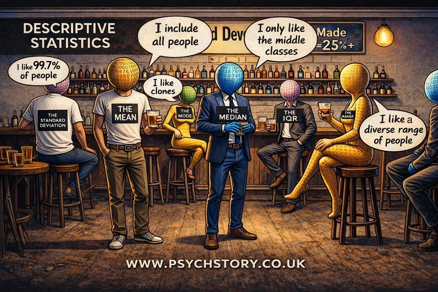
MEASURES OF CENTRAL TENDENCY
Questions such as “How many miles do I run each day?” or “How much time do I spend on my iPhone each day?” can be hard to answer because the results vary from day to day. It’s better to ask, “How many miles do I usually run?” or “On average, how much time do I spend on my iPhone ?”. In this section, we will look at three methods of measuring central tendency: the mean, the median and the mode. Each measure gives us a single value that might be considered typical. Each measure has its strengths and weaknesses. Measures of central tendency describe the most typical value in a data set and are calculated in different ways. Still, all are concerned with finding a ‘typical’ value from the middle of the data. For any given variable, each member of the population will have a particular value; for example, the number of positive ratings for photographs of the opposite sex. These values are called data. We can use measures of central tendency on the entire population to obtain a single value, or on a subset or sample to estimate the population's central tendency.
OUTLINE, CALCULATE AND EVALUATE THE USE OF DIFFERENT MEASURES OF CENTRAL TENDENCY:
MEAN
MEDIAN
MODE
This could include saying which one you use to calculate this data set, e.g. 2, 2, 3, 2, 3, 2, 3, 2, 97 - would you use mean or median here?
THE MEAN
Perhaps the most widely used measure of central tendency is the mean, which most people refer to in everyday life as the "average." It is the arithmetic mean of a dataset and the most sensitive measure of central tendency, as it takes every value into account. Unlike the mode, which identifies only the most frequent value, or the median, which locates only the central position in an ordered sequence, the mean incorporates every score in the dataset into a single representative value. This makes it a particularly informative measure because it does not simply describe where one point in the data sits but reflects the overall distribution of scores across the entire dataset. This sensitivity to all values in the dataset is what distinguishes the mean from the other measures of central tendency and why it is so widely used in psychological research. When researchers want a single figure that summarises the general level of performance, response, or score across a group of participants, the mean provides that figure more completely than either the mode or the median can. For example, if an apprentice sits five examinations and scores 94%, 80%, 89%, 88%, and 99%, a mean score of 90% draws on all five results equally, producing a figure that genuinely represents their overall level of attainment across the set rather than simply identifying their most frequent or middle score.
ADVANTAGES OF THE MEAN
Sensitive to Precise Data: The mean accounts for every value in the dataset, making it a highly sensitive measure that reflects the data's nuances.
Mathematically Manageable: It fits nicely into further statistical analyses and mathematical calculations, facilitating various statistical tests.
Widely Used and Understood: As a standard measure of central tendency, most people widely recognise and easily interpret the mean.
DISADVANTAGES OF THE MEAN
Affected by Extreme Values:
The mean takes every value in the data set into account, which makes it a sensitive and informative measure. However, this sensitivity is also its weakness. The mean is heavily influenced by extreme values, known as outliers. A single unusually high or low score can pull the mean away from what is otherwise a representative centre point for the data. Consider the data set 3, 5, 7, 9, 40. The mean is 12.8, yet four of the five values fall below 10. The value of 40 has skewed the mean to the point where it no longer accurately represents the data set. In such cases, the median is often a more appropriate measure of central tendency, as it is unaffected by extreme values. The median of this data set remains 7, which far more accurately reflects where the majority of scores sit
Not Always Representative: In highly skewed distributions, the mean may not accurately reflect the data's central tendency.
Inapplicable to Nominal Data: The mean cannot be calculated for nominal or categorical data, limiting its applicability.
HOW TO CALCULATE THE MEAN
The mean is calculated by adding together all the values in a data set and dividing by the total number of values. It is the most commonly used measure of central tendency in psychological research.
For example, in the data set 3, 5, 7, 9, 11, adding the values gives 35. Dividing by the number of values (5) gives a mean of 7.
The formula is expressed as:
Mean = ΣX ÷ n
Where ΣX represents the sum of all values and n represents the total number of values in the data set.
THE MEDIAN
In cases with extreme values in a data set, using the mean can be difficult to obtain a true representation of the data, so the median can be used instead. The median is not affected by extreme scores, so it is ideal for a heavily skewed data set. It is also easy to calculate, as the median takes the middle value within the data set. Example: If there is an odd number of scores, then the median is the number which lies directly in the middle when you arrange the scores from lowest to highest. Using the previous data set as an example, five values would be placed in the following order: 12%, 67%, 71%, 72%, and 79%. Therefore, the median is the third value, which is 71%. Interestingly, the median score for this data set is 71%, whereas the mean is 60.2%. It is apparent from the data that the median is a more representative measure, not distorted by the extreme score of 12%, unlike the mean. If there is an even number of values within the data set, two values will fall directly in the middle. In this case, the midpoint between these two values is calculated. To do this, the two middle scores are added together and divided by two. This value will then be the median score.
Example: If the above data set included a sixth score, e.g., 12%, 34%, 67%, 71%, 72%, and 79%, then the median score would be 69% (67% + 71% ÷ 2).
ADVANTAGES OF THE MEDIAN
Resistant to Outliers: Unlike the mean, the median is not skewed by extreme values, making it a more robust measure in the presence of outliers.
Represents the Middle Value: It accurately reflects the central point of a distribution, especially in skewed datasets, by dividing the dataset into two equal halves.
Applicable to Ordinal Data: The median can be calculated for ordinal data (data that can be ranked) as well as interval and ratio data, offering wider applicability than the mean.
DISADVANTAGES OF THE MEDIAN
Less Sensitive to Data Changes: The median may not capture small changes in the data, especially when they occur far from the dataset's centre.
Not as Mathematically Handy: It doesn't lend itself as easily to further statistical analysis as the mean, due to its nonparametric nature.
Difficult to Handle in Open-Ended Distributions: Calculating the median can be challenging for distributions with open-ended intervals since the exact middle value may not be clear
HOW TO CALCULATE THE MEDIAN
ODD-NUMBERED DATA SETS
When a data set contains an odd number of values, calculating the median is straightforward. Arrange all values in ascending order and identify the middle value. That value is the median.
For example, in the data set 3, 5, 7, 9, 11, the middle value is 7, making it the median.
To find the middle position, use the formula (n + 1) ÷ 2, where n is the total number of values. With five values, that gives (5 + 1) ÷ 2 = 3, meaning the median is the third value in the ordered sequence.
EVEN-NUMBERED DATA SETS
When a data set contains an even number of values, there is no single middle value. Instead, the median is calculated by identifying the two central values, adding them, and dividing by 2.
For example, in the data set 3, 5, 7, 9, the two central values are 5 and 7. Adding them gives 12, and dividing by 2 gives a median of 6.
To locate the two central values, use the formula n ÷ 2 and (n ÷ 2) + 1, where n is the total number of values. With four values, that gives positions 2 and 3, which are 5 and 7 in the ordered sequence.
THE MODE
The mode is the value that appears most frequently in a dataset. It is the simplest of the three measures of central tendency to identify, requiring no calculation beyond counting how often each value occurs. However, simplicity comes at a cost. The mode tells us nothing about the distribution of the remaining values in the dataset, only which single value occurs most often. This means it can produce a deeply misleading picture of the data if the most frequently occurring value is not representative of the dataset as a whole.
Consider a student who sits five examinations and scores 94%, 80%, 89%, 88%, and 99%. If a sixth examination is added to the dataset and the student scores 12%, that score would not affect the mode. But if the student happened to score 12% twice, it would become the mode, despite being the lowest score in the entire dataset and entirely unrepresentative of the student's overall performance. In such a case, reporting the mode as a summary of the student's attainment would be not just unhelpful but actively misleading. This is the central limitation of the mode as a measure of central tendency: it is sensitive only to frequency, not to the overall shape or distribution of the data
ADVANTAGES OF THE MODE
Versatile with Data Types: The mode is unique because it can be applied to categorical data, unlike the mean and median. For instance, in survey data on modes of transportation such as 'car', 'bus', or 'walk', the mode identifies the most frequently occurring response, offering valuable insights into the most common category.
DISADVANTAGES OF THE MODE
Potential for Multiple Modes: A dataset can have more than one mode, resulting in a bimodal situation with two modes or a multimodal situation with several modes. This can complicate the interpretation of the data.
Possibility of No Mode: If all data points are unique and occur only once, the dataset has no mode. This lack of a mode can limit its usefulness as a measure of central tendency in such datasets.
HOW TO CALCULATE THE MODE
The mode is simply the value that appears most frequently in a data set. To find it, arrange the values in ascending order and identify which value occurs most often.
For example, in the data set 3, 5, 7, 7, 9, the value 7 appears twice, and all others appear once. The mode is therefore 7.
MORE THAN ONE MODE
A data set can have more than one mode. If two values occur with equal frequency, the data set is bimodal. If three or more values share the highest frequency, the data set is multimodal. For example, in the data set 3, 5, 5, 7, 7, 9, both 5 and 7 appear twice, making the data set bimodal with modes of 5 and 7.
WHEN THERE IS NO MODE
If every value in a data set appears only once, the data set has no mode. In such cases, the mode is not a useful measure of central tendency and researchers would rely on the mean or median instead
Exam Hint: When asked to calculate any measure of central tendency, show your calculations. Often, the question will be worth two or three marks, so it is important to show how you reached your final answer for maximum marks!
MEASURES OF CENTRAL TENDENCY SUMMARY
MEASURES OF DISPERSION
SPECIFICATION: OUTLINE, CALCULATE AND EVALUATE THE USE OF DIFFERENT MEASURES OF DISPERSION:
THE RANGE
THE INTERQUARTILE RANGE
THE NORMAL DISTRIBUTIONS AND SKEWED DISTRIBUTIONS
THE STANDARD DEVIATION
*NB You are NOT required to calculate standard deviation; however, you must understand why they are used and what they show.
There are three main measures of dispersion commonly used in psychology. Each offers a different level of detail about the spread of scores.
WHY DO WE NEED MEASURES OF DISPERSION?
Before we begin the topic of measures of dispersion, the following exercise demonstrates why both measures of dispersion and measures of central tendency are vital for understanding any data set.
EXERCISE TWO
You are considering enrolling in an A-level Psychology course at a college. You have heard mixed reviews about the quality of teaching and want to make the best possible choice about which class to join. To help you decide, you request recent exam performance data from four different teachers.
The information you receive is limited:
Ms Ainsworth’s class
Mean average score: 70Mr Darwin’s class
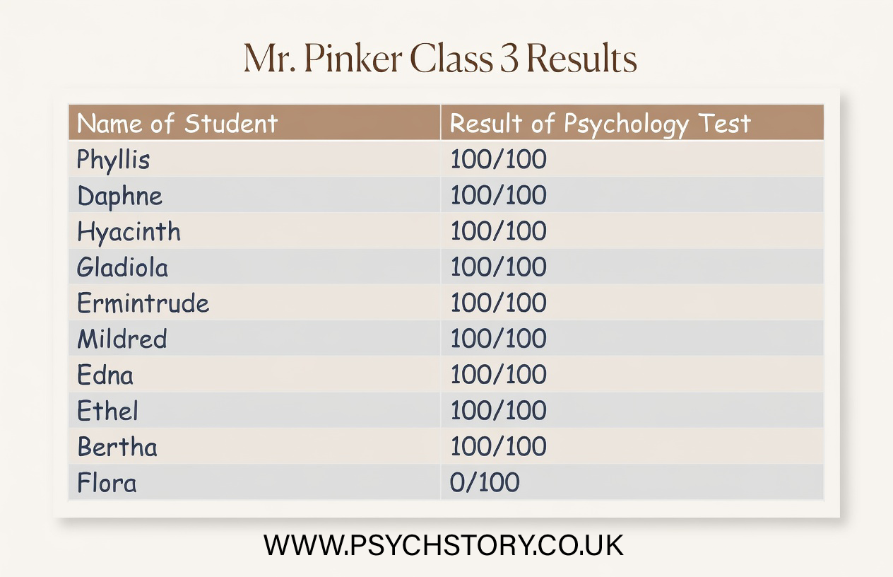
Mean average score: 70Mr Pinker’s class
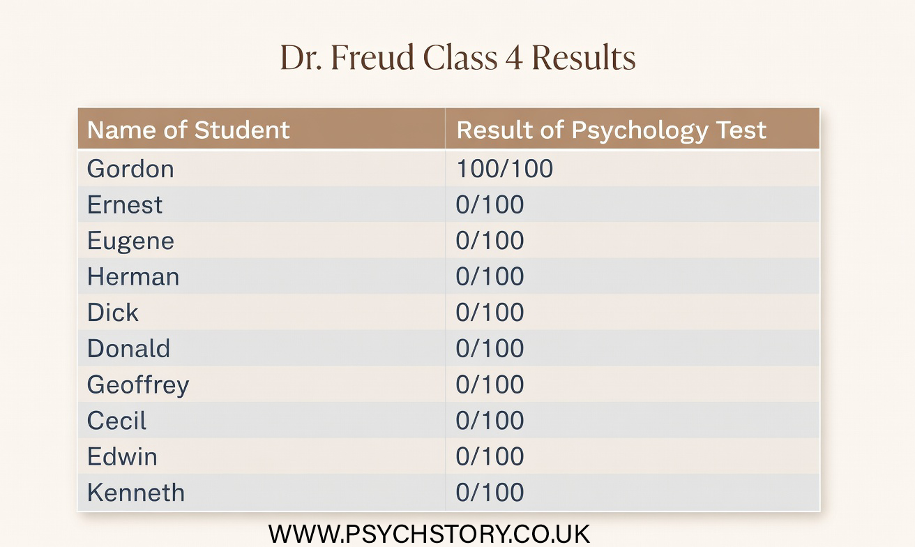
Range: 101Dr Freud’s class
Range: 101
At this stage, you have not been given the raw scores or any other descriptive statistics.
QUESTION 1
Based only on the information above, which class would you choose, and why ( refer to the data above and in the summaries below)?

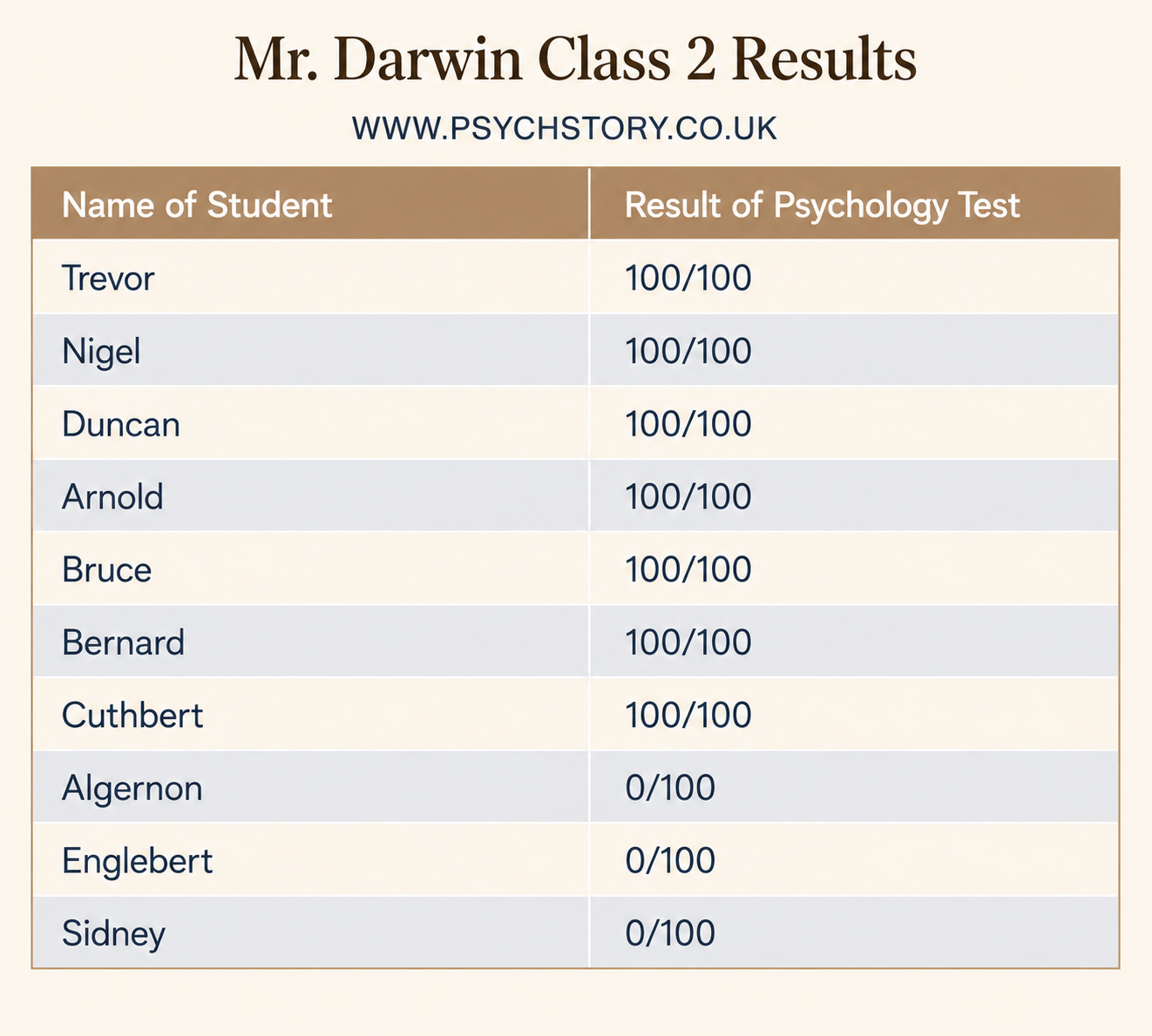
Refer to the data from the four classes. See pictures above
QUESTION 2: Having now seen the raw data, explain what the original statistics failed to show. In your answer, refer to at least two classes and explain why the first set of information was not enough to make a secure judgment.
QUESTION 3: If you could ask for one additional descriptive statistic for all four classes before making your choice, which would be most useful, and why?
OPTIONAL EXTENSION: Which class now appears to be the strongest, and what features of the data led you to that conclusion
ANALYSIS OF THE RESULTS FROM THE DIFFERENT PSYCHOLOGY CLASSES
The Ainsworth and Darwin data demonstrate that a mean of 70 can be highly misleading without additional information about the distribution of scores. In Ms Ainsworth’s class, most scores cluster closely around the mean, so it accurately reflects the typical student’s performance. In contrast, Mr Darwin’s class shows a wide spread of scores from very low to very high, with the mean of 70 arising only because extreme values balance each other out. The same measure of central tendency, therefore, supports very different interpretations depending on how the data are distributed.
The Pinker and Freud data reveal a parallel problem with the range. Both classes have the same range of 101, yet their patterns are entirely different. In Mr Pinker’s class, most students achieve high scores, with one unusually low score artificially stretching the range. In Dr Freud’s class, most students achieve very low scores, with one unusually high score inflating the range. The range is driven solely by the two extreme values and tells us nothing about where most students are actually performing. These scenarios highlight why relying on a single descriptive statistic is rarely enough to make a secure judgment. The original information (means for two classes and ranges for the other two) failed to reveal the shape and consistency of the distributions, making it impossible to reliably evaluate teaching quality. Raw scores alone are overwhelming and do not easily show patterns; descriptive statistics organise the data and make key features visible. However, no single statistic is sufficient on its own.
Measures of central tendency (mean, median, mode) indicate where the centre of the data lies, while measures of dispersion (range, interquartile range, standard deviation) show how spread out the scores are. In Ainsworth’s class, the mean works well because scores are clustered, but in Darwin’s class, the median would provide a better picture of typical performance as it is unaffected by extremes. Similarly, in Pinker’s and Freud’s classes, the interquartile range or standard deviation would better reveal the performance of the middle 50% of students or the average deviation from the mean, rather than being distorted by outliers. Taken together, these statistics allow us to move beyond isolated numbers and properly interpret both the level and the consistency of performance. This is essential when evaluating real-world data, such as choosing a class or assessing whether her research findings support a study’s aims.
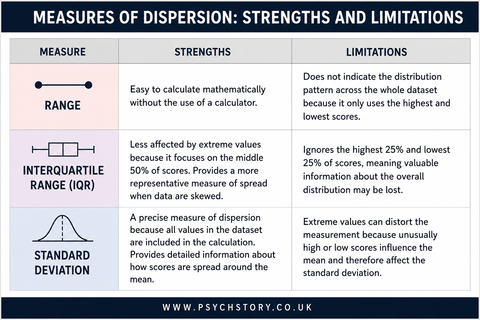
THE RANGE

The range is the simplest measure of dispersion. It is calculated by subtracting the lowest score from the highest score in the data set. In the jogging experiment, both the jogging and control conditions have a range of 9. This indicates that the total spread from the lowest to the highest rating is identical across both groups. However, the range has a significant limitation: it is based only on the two most extreme scores. A single unusually high or low result can therefore make the range appear much larger than it is for most participants.
CALCULATION OF THE RANGE:
The range is calculated by subtracting the lowest score from the highest score in the dataset and (usually) adding 1. This addition of 1 is a mathematical correction to account for any rounding that may have occurred in the dataset's scores.
EVALUATION OF THE RANGE
The range is straightforward to calculate, offering a clear advantage in its simplicity.
It only considers the two extreme scores, the highest and the lowest, which may not accurately represent the dataset as a whole.
It's crucial to acknowledge that the range may be the same in datasets with a strong negative skew (e.g., most students scoring well on a psychology test) and those with a strong positive skew (e.g., most students scoring poorly on a psychology test), highlighting a limitation in its ability to distinguish between differently skewed datasets.
THE SHAPE OF THE DATA: WHY DISTRIBUTION MATTERS
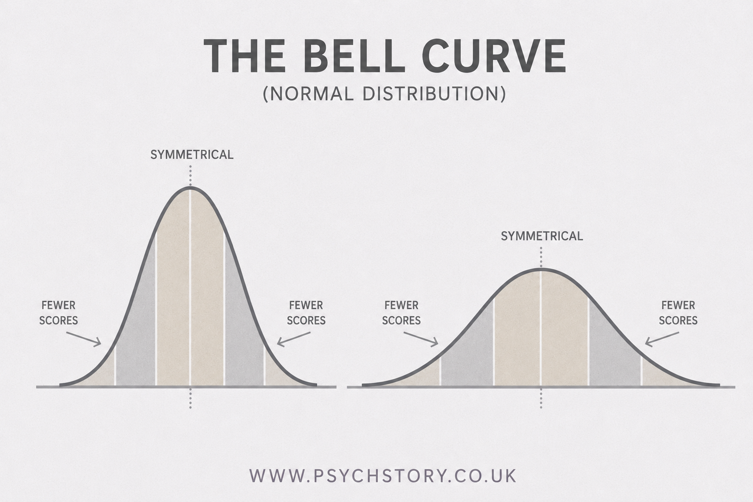
As we know from the analysis of the psychology classes above, knowing the average score and how widely the scores are spread is important, but it is still not the full picture. Researchers also need to understand the overall shape of the data — that is, how the scores are distributed across the possible range of values. The shape reveals whether the scores cluster symmetrically around the mean or whether they pile up more towards one end, leaving a long tail on the other side. This is where the concept of the normal distribution becomes central to psychological research. When data follow a normal distribution, they form a symmetrical, bell-shaped curve (often simply called a bell curve). In a perfect normal distribution, the mean, median and mode all coincide at the centre, and the scores taper off equally on both sides. Most scores fall close to the mean, with fewer and fewer appearing as we move further away in either direction.
THE NORMAL DISTRIBUTION CURVE
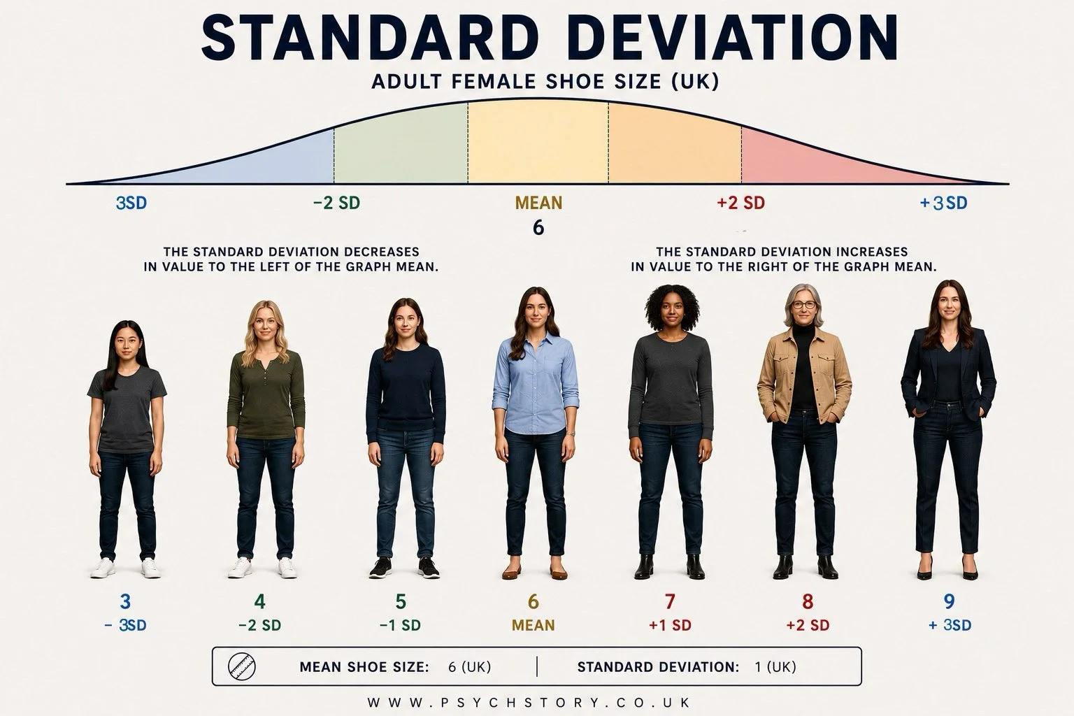
Female shoe size is a useful illustration of how scores naturally distribute themselves. The majority of women in the UK wear a size 6 shoe. Fewer wear size 5 or 7; fewer still wear size 4 or 8; and very few wear size 3 or 9. As we move further away from the average, shoe sizes become progressively less common. Most women simply have feet that are neither unusually small nor unusually large. This pattern occurs because shoe size is not determined by a single factor. It is influenced by many biological and environmental factors, including genetics, hormones, nutrition and development. Some influences make feet slightly larger, while others make them slightly smaller. For most women, these influences balance one another out, producing shoe sizes that are fairly average rather than extreme.
The same principle applies to many human characteristics. Most people possess average intelligence, reaction times, memory abilities, and heights. Extreme values certainly exist, but they are much less common. If the shoe sizes of thousands of women were plotted from the smallest size on the left to the largest size on the right, the scores would cluster around the middle of the range and gradually become less common towards either extreme. The graph would rise in the middle because size 6 occurs most frequently, then fall away on both sides because very small and very large shoe sizes occur less often.
The width of the distribution would show how spread out the shoe sizes were. A narrow distribution would mean most women have shoe sizes very close to the average, e.g., all women are sized 4–6. A wider distribution would mean greater variation among women’s shoe sizes, e.g., sizes 1–10. The same principle applies to psychology grades. If most students achieved similar grades, the distribution would be narrow. If results varied widely, from low to high grades, the distribution would be wider.
Because average scores occur frequently and extreme scores occur relatively rarely, the graph rises in the middle and falls away towards both ends. The height of the curve reflects frequency, that is, the number of people obtaining a particular score, while the width of the curve reflects the spread of scores across the range. The curve, therefore, becomes tallest where scores are most common and gradually tapers away where scores become increasingly rare. The resulting pattern forms the familiar bell shape known as a normal distribution or normal distribution curve.
The shape resembles a bell because most people cluster around the average, creating a high central peak, while progressively fewer people occupy the extreme ends of the distribution. This produces a curve that rises steeply towards the centre and falls away gradually on either side, creating the characteristic bell-shaped appearance.

THE SYMMETRY OF NORMAL DISTRIBUTIONS
In a normal distribution, the pattern is symmetrical. This means that the left side mirrors the right side. Very small shoe sizes are rare, but so are very large shoe sizes. As we move away from the middle in either direction, scores become progressively less common.
In a perfectly normal distribution, the mean, median and mode all fall at exactly the same point, the centre of the distribution. This is a direct consequence of its symmetry.
Using the shoe size example, imagine that size 6 is at the centre of the distribution. Size 6 is the most frequently occurring shoe size, so it is the mode. It is also the size that sits in the middle of the ranked distribution, so it is the median. Finally, because the distribution is balanced equally on both sides, the average shoe size is also pulled to size 6, making it the mean. The mean, median and mode are therefore not the same by coincidence. They are the same because the data are balanced perfectly around the centre.
PROPERTIES OF A NORMAL DISTRIBUTION
THE NORMAL DISTRIBUTION So far, we have looked at measures of central tendency, which tell us where the typical score lies, and measures of dispersion, which tell us how spread out the scores are. However, there is still one more important piece of the picture: the overall shape of the data. The shape shows us how the scores are actually arranged across the full range of possible values.
WHAT IS A NORMAL DISTRIBUTION? A normal distribution curve, often called a bell curve due to its bell-like shape, is a graphical representation of a statistical distribution where most observations cluster around a central peak — the mean — and taper off symmetrically towards both tails. This curve is perfectly symmetrical because the mean, median, and mode are all exactly the same value and are located at the centre of the distribution. It is this coincidence of the three measures of central tendency that creates the balanced, mirror-image shape on both sides of the mean.
WHY IS IT CALLED “NORMAL”? The term “normal” can sound confusing at first. It does not mean this is the only correct way for data to behave. The name comes from both historical and practical reasons: the normal distribution appears very frequently in real life, and it has properties that make it especially useful in statistics.
IT APPEARS FREQUENTLY IN REAL LIFE. If we measure large numbers of people across many human characteristics, the data often follow a normal distribution. Height, blood pressure, reaction times, and many psychological test scores are good examples. In each case, most people’s scores cluster around the average value, with fewer and fewer people scoring extremely high or extremely low. A simple everyday example is daily calorie intake. Most people consume a moderate number of calories each day. Very few survive on almost nothing (for example, just one bowl of cornflakes), and very few consume an enormous amount (for example, ten steaks with chips every day). When we plot this kind of data, it forms the familiar symmetrical bell shape. This natural clustering around the mean is why the distribution is described as “normal”.
THE CENTRAL LIMIT THEOREM. There is also a deeper statistical reason why the normal distribution appears so often. The central limit theorem states that when we take a large number of random measurements or influences and add them together, the resulting distribution tends to be normal, even if the individual pieces did not start out that way. This helps explain why so many variables in psychology appear bell-shaped when studied in large samples.
USEFUL MATHEMATICAL PROPERTIES
The normal distribution has one major practical advantage: once we know only the mean and standard deviation, we can describe and predict much about the entire data set. These clear mathematical properties make later stages of analysis, including hypothesis testing and inferential statistics, much more straightforward.
WHAT DOES THE CURVE ACTUALLY LOOK LIKE? When data follow a normal distribution, plotting them on a graph yields a smooth, symmetrical bell-shaped curve. The highest point of the curve is at the mean. As we move away from the mean in either direction, the number of scores gradually decreases, creating two balanced tapering tails. Most observations lie close to the average, and only a small proportion appear at the extreme ends
These characteristics make the normal distribution a fundamental statistical concept, underpinning many theoretical and practical applications in various fields.
EXAMPLES OF A NORMAL DISTRIBUTION
Examples of phenomena that typically exhibit a normal distribution include:
Height of the Population: The height distribution in a given population typically follows a normal distribution, with most individuals having average height. The numbers gradually decrease for those who are significantly taller or shorter than average, due to a mix of genetic and environmental factors.
IQ Scores: The distribution of IQ scores across a population also tends to follow a normal distribution. Most individuals' IQs fall within the average range, while fewer have very high or very low IQs, reflecting the influence of genetic and environmental factors.
Income Distribution: Although not perfectly normal due to various socioeconomic factors, income distribution within a country often resembles a normal curve, with a larger middle class and fewer individuals at the extremes of wealth and poverty.
Shoe Size: The distribution of shoe sizes, particularly within specific gender groups, tends to be normally distributed. This is because the physical attributes that determine shoe size are relatively similar across most of the population, with fewer individuals requiring very large or very small sizes.
Birth Weight: Newborn weights typically follow a normal distribution, with most babies falling within a healthy weight range and fewer being significantly underweight or overweight at birth.
These examples illustrate how the normal distribution naturally arises in various contexts, providing a useful model for understanding and analysing data in fields ranging from biology and psychology to economics and social sciences.

SKEWED DISTRIBUTIONS
NOT EVERY DISTRIBUTION IS NORMAL
In a normal distribution, scores are spread relatively evenly around the mean, creating a symmetrical bell shaped curve. However, this does not always occur. Sometimes most scores fall on one side of the mean rather than being evenly distributed across both sides. When this happens, the distribution becomes lopsided rather than symmetrical. Because most of the scores are concentrated on one side of the graph, the distribution develops a large bulge on that side. The opposite side contains fewer scores and becomes stretched out into a long tail. The further the distribution departs from symmetry, the greater the skew. For example, if most people score highly on an easy test, the majority of scores will be found to the right of the mean. The graph will therefore contain a large concentration of scores on the right hand side and a smaller number of low scores stretching out towards the left. The distribution is no longer balanced around the mean and becomes negatively skewed
WHAT IS SKEWNESS?
Skewness occurs when the scores are not evenly distributed around the mean. Instead of being symmetrical, most of the data clusters on one side, with a long tail extending to the other. There are two main types of skew:
Results (data) can be "distributed" (spread out) in different ways.
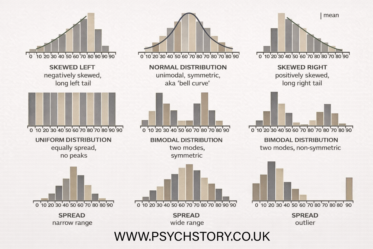
RIGHT SKEWED OR POSITIVE DISTRIBUTION.
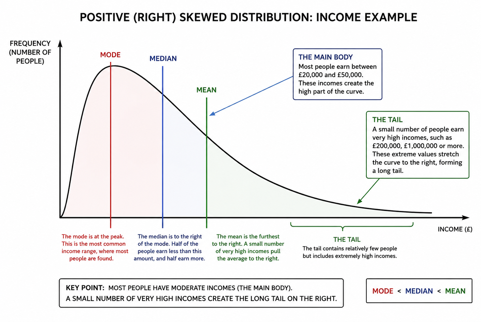
A positive skew is when the long tail is on the positive side of the peak, and the mean is to the right of the peak value. Some people say it is "skewed to the right".A positively skewed distribution has a mean, median, and mode that are positive rather than negative or zero; i.e., the data are more concentrated on one side of the scale, with a long tail on the right. It is also known as a right-skewed distribution, where the mean is generally to the right of the data's median. Positive (right-skewed) distributions occur when the data's tail is longer towards the right-hand side of the distribution. This usually means that a few high values stretch the graph to the right, while most of the data cluster towards the lower end. Here are examples of positive distributions and explanations for why they exhibit right-skewness:

POSITIVE SKEW (RIGHT-SKEWED) The long tail is on the right side of the peak. Most of the scores are bunched up on the lower end, but a small number of unusually high scores stretch the tail out to the right. This pulls the mean to the right of the median and mode.
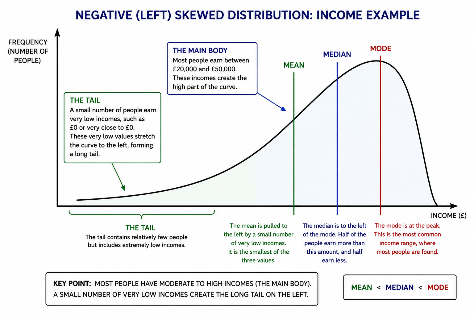
NEGATIVE SKEW (LEFT-SKEWED) The long tail is on the left side of the peak. Most of the scores are bunched up on the higher end, but a small number of unusually low scores stretch the tail out to the left. This pulls the mean to the left of the median and mode.
WHY DO THE MEAN, MEDIAN AND MODE DIFFER IN SKEWED DISTRIBUTIONS?
In a normal distribution, the mean, median, and mode all sit at exactly the same central point.
In a skewed distribution, however, the extreme scores in the long tail pull the three measures apart.
Here’s why they end up in different positions:
The mode is the most common score. It stays at the highest point on the graph — where most of the scores are clustered.
The median is the middle value when all the scores are arranged from lowest to highest. It is not strongly affected by extreme scores.
The mean (the average) is different. Because it is calculated using every single score, it tends to be pulled towards the extreme values in the tail.
POSITIVE (RIGHT) SKEW
A positively skewed distribution occurs when most scores are clustered towards the lower end of the scale, while a relatively small number of unusually high scores stretch the distribution towards the right. These high values create a long right tail on the graph, giving the distribution its characteristic asymmetric shape. The term positive skew refers to the direction of the tail, not where most of the scores are located. Because the tail extends towards the positive end of the scale (the right side), the distribution is positively skewed, or right-skewed. In contrast, the majority of the data are concentrated towards the left-hand side of the graph. For example, imagine a very difficult psychology examination. Most students score between 20% and 50%, causing the bulk of the distribution to cluster towards the lower end of the scale. However, a small number of exceptionally able students may achieve scores of 80%, 90%, or even close to 100%. These relatively rare high scores create a long right tail. Although most students achieved low marks, the few very high scores pull the mean upward. The high scores in the right tail have an important effect on the measures of central tendency. They pull the mean upwards towards the tail, while the median is less affected, and the mode remains at the peak where the largest number of scores occurs. As a result, in a positively skewed distribution:
Mode < Median < Mean
In other words, the mean lies furthest to the right because it is most affected by the extremely high scores, the median sits in the middle, and the mode remains closest to the peak where the majority of scores are found. A positively skewed distribution should not be confused with a distribution containing only positive numbers. The scores themselves may all be positive. In the examination example, every score may be above zero, yet the distribution is still positively skewed because most students achieved relatively low marks and only a few achieved unusually high marks. It is the shape of the distribution that determines the skew, not whether the values themselves are positive or negative. A classic real-world example is income. Most people earn moderate salaries, creating the main body of the distribution. However, a relatively small number of individuals earn extremely high incomes, such as successful entrepreneurs, celebrities, hedge fund managers, or CEOs. These few very high values create a long right tail, pulling the mean income above both the median and the mode. This is why average income is often much higher than what a typical person actually earns
REAL-LIFE EXAMPLES OF POSITIVE (RIGHT-SKEWED) DISTRIBUTIONS
Here are some clear examples that show why positive skew is so common:
INCOME AND WEALTH: Most people earn relatively ordinary salaries and possess modest levels of wealth. However, a small number of individuals earn millions of pounds or own vast fortunes. These extreme values stretch the distribution towards the higher end of the scale, creating a long right-hand tail.
HOUSE PRICES: Most homes are priced within a relatively narrow range. However, a small number of luxury properties, penthouses, and mansions can be worth many millions of pounds. These exceptionally expensive properties create a long right tail and pull the mean house price upwards.
SCORES ON A DIFFICULT EXAMINATION: When an examination is particularly challenging, many students achieve relatively low marks. However, a small number of exceptionally able students obtain very high scores. These high marks stretch the distribution towards the right.
CRIMINAL CONVICTIONS Most people have never been convicted of a crime and therefore have zero convictions. A smaller number have one or two convictions, while a very small number of prolific offenders accumulate dozens of convictions. These extreme cases create a long right tail.
NUMBER OF SEXUAL PARTNERS: Most people report a relatively modest number of sexual partners across their lifetime. However, a small number of individuals report exceptionally large numbers. These unusually high values stretch the distribution towards the right.
SOCIAL MEDIA FOLLOWERS: Most people have relatively few followers on social media platforms. However, celebrities, influencers, sports stars, and major organisations may have millions. These extreme values create a pronounced right skew.
VIDEO VIEWS ON SOCIAL MEDIA: Most videos attract relatively few views. A small number go viral and accumulate millions of views. These viral videos create a long tail towards the higher end of the distribution.
BOOKS SOLD BY AUTHORS: Most authors sell relatively few copies of their books. A small number become bestsellers, selling millions of copies. These highly successful authors stretch the distribution towards the right.
REACTION TIMES: Most people respond within a relatively narrow time range in psychological experiments. However, a small number of unusually slow responses occur due to distraction, fatigue, or lapses in attention. These slower responses create a right skew because they yield larger reaction-time values.
SCIENTIFIC CITATIONS: Most scientific papers receive relatively few citations. A small number become highly influential and are cited thousands of times. These influential papers create a long right-hand tail
These examples all show the same pattern: most data points cluster at the lower end, while a few extremely high values create the long tail on the right. This is what positive (right) skew looks like in real life
LEFT SKEWED OR NEGATIVE DISTRIBUTION

NEGATIVE (LEFT) SKEW
A negatively skewed distribution occurs when most scores are clustered towards the higher end of the scale, while a relatively small number of unusually low scores stretch the distribution towards the left. These low values create a long left tail on the graph, giving the distribution its characteristic asymmetric shape. The term negative skew refers to the direction of the tail, not where most of the scores are located. Because the tail extends towards the negative end of the scale (the left side), the distribution is described as negatively (left) skewed. In contrast, the majority of the data is concentrated towards the right-hand side of the graph. For example, imagine an easy psychology examination. Most students score between 80% and 100%, causing the bulk of the distribution to cluster toward the right side of the graph. However, a small number of students may score 20%, 30%, or 40% because they were absent for part of the course, did not revise, or misunderstood the questions. These relatively rare low scores create a long left tail. Although most students achieved high marks, the few low scores pull the mean downward. The few low scores in the left tail have an important effect on the measures of central tendency. They pull the mean downward toward the tail, while the median is less affected and the mode remains at the peak where the largest number of scores occurs. As a result, in a negatively skewed distribution:
Mean < Median < Mode
In other words, the mean lies furthest to the left because it is most affected by the extremely low scores, the median sits in the middle, and the mode remains closest to the peak where the majority of scores are found. A negatively skewed distribution should not be confused with a distribution containing negative numbers. The scores themselves may all be positive. In the examination example, every score may be above zero, yet the distribution is still negatively skewed because most students achieved high marks and only a few achieved unusually low marks. It is the shape of the distribution that determines the skew, not whether the values themselves are positive or negative
EXAMPLES OF NEGATIVE DISTRIBUTIONS AND EXPLANATIONS
In a negatively skewed distribution, most scores or values cluster towards the higher end, while a few unusually low scores create a long tail extending to the left. This pulls the mean to the left of the median and mode.
Here are some clear real-life examples:
SCORES ON AN EASY EXAM: Most students achieve high marks because the test is relatively straightforward. The majority of scores cluster towards the upper end of the scale, creating the main body of the distribution. However, a small number of students perform poorly due to factors such as lack of preparation, illness, anxiety, or misunderstanding the material. These unusually low scores stretch the distribution towards the left, creating a long left tail. As a result, the mean score is pulled downwards by these relatively rare low values.
AGE OF RETIREMENT: Most people retire at roughly the same age, typically between 65 and 68. This creates a large cluster of scores towards the higher end of the distribution. However, a small number of individuals retire much earlier due to ill health, redundancy, inheritance, or substantial personal wealth. These relatively rare early retirements create a long tail extending towards lower ages. The result is a negatively skewed distribution in which the mean retirement age is lower than the most common retirement age.
AGE OF DEATH: In developed countries, most people survive into their seventies, eighties, or beyond. Consequently, the majority of ages at death are concentrated towards the higher end of the scale. However, a relatively small number of people die much younger due to accidents, congenital conditions, violence, or serious illness. These early deaths create a long left tail in the distribution. Although most people live to older ages, the small number of very young deaths pulls the mean downward.
SCORES ON AN ELITE SPORTING EVENT: In an Olympic long jump competition, most elite athletes achieve jumps within a relatively narrow range because they are all highly skilled performers. However, a small number may record unusually short jumps due to injury, poor technique, fatigue, or fouls. These lower-than-expected performances create a tail extending towards the lower end of the distribution. The majority of athletes cluster near the higher scores, resulting in a negatively skewed distribution.
LIFESPAN OF CONSUMER PRODUCTS: Most products perform close to their expected lifespan or even exceed it. For example, many washing machines, televisions, or refrigerators may last for several years beyond their warranty period. However, a small number fail unusually early because of manufacturing defects, accidental damage, or component failure. These rare early breakdowns create a long left tail, while most products remain clustered around the expected lifespan.
EXAMINATION GRADES IN A HIGH ABILITY SCHOOL"|: In highly selective schools or among very able students, most examination grades are concentrated towards the top of the mark range. Many students achieve A or A* grades, resulting in a cluster of high scores. However, a small number of students may underperform because of illness, stress, or personal circumstances. These lower grades create a long tail extending towards the lower end of the distribution, resulting in a negative skew.
WEALTH IN A COMMUNIST STATE (THEORETICAL EXAMPLE): If wealth were distributed almost equally across a population, most people would possess similar levels of income and assets. However, a small number of individuals might possess substantially less wealth due to unemployment, disability, or social disadvantage. These relatively low, relatively rare values would create a left tail, producing a negatively skewed distribution. This example is useful because it contrasts with modern capitalist societies, where wealth distributions are usually positively skewed.
NUMBER OF CRIMES COMMITTED: In some highly selective offender samples, most offenders may have committed numerous offences, while a small number have committed only one or two. In this situation, the few low offence counts create a long left tail. Although crime in the general population is usually positively skewed because most people commit no crimes at all, specialised offender populations can produce a negatively skewed distribution. In all these examples, most of the data is bunched toward the higher end, while a few unusually low values extend the left tail. This is what gives a negative (left-skewed) distribution its characteristic shape.
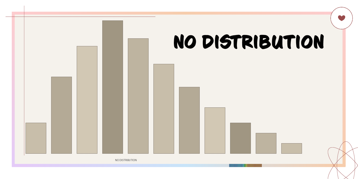
NO DISTRIBUTION
Sometimes the data do not follow any clear, known pattern, such as a normal or skewed distribution. In this case, we say there is no identifiable distribution or the distribution is unknown. The scores are scattered in a way that does not form a recognisable shape on a graph, making it difficult to predict how the data are organised or to apply standard statistical rules confidently
QUARTILES AND THE INTERQUARTILE RANGE
QUARTILES AND THE INTERQUARTILE RANGE
The range, as discussed, is the simplest possible measure of spread: subtract the lowest score from the highest and the result tells researchers how far the data stretches from one extreme to the other. The problem is that it is entirely at the mercy of those two extreme values. A single unusually high or unusually low score — an outlier — can produce a range that bears almost no resemblance to how spread out the majority of scores actually are. A researcher looking at that inflated range might conclude that participants varied enormously in their responses, when in reality most scores clustered closely together. The range, in short, is a measure of spread that tells you about the edges rather than the middle, which is rarely where the interesting information lives.
This is the problem that quartiles and the interquartile range were designed to solve.
t
QUARTILES
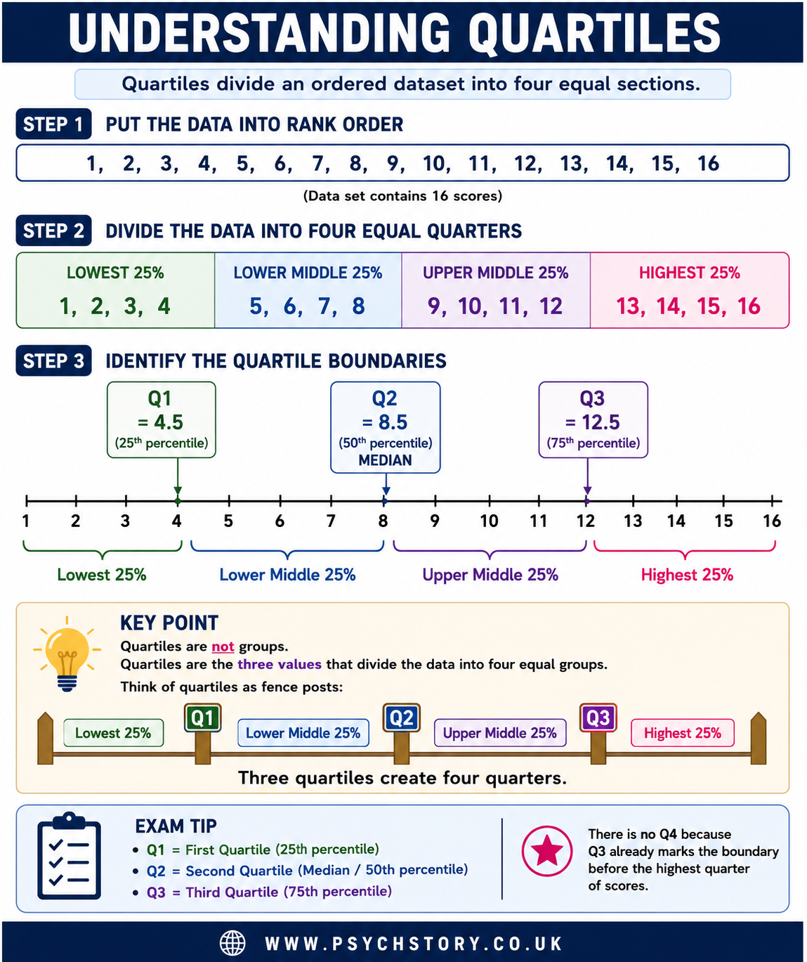
Before the interquartile range can be calculated, it is necessary to understand what quartiles are, because the two concepts are closely related but distinct. Quartiles are simply the three points that divide an ordered dataset into four equal groups, each containing 25% of the scores. The dataset must first be arranged from lowest to highest value, and then these three dividing points are identified. The first quartile, known as Q1, marks the boundary below which the lowest 25% of scores fall. The second quartile, Q2, is the midpoint of the entire dataset — in other words, it is the median, the point below which 50% of scores fall. The third quartile, Q3, marks the boundary below which 75% of scores fall, meaning that only the top 25% of scores lie above it. It helps to think of the dataset as being cut into four equal slices, like a loaf of bread divided into quarters. Q1, Q2, and Q3 are simply the three cuts. The quartiles themselves are not ranges or groups; they are the boundary points between those groups.
THE INTERQUARTILE RANGE
The interquartile range, commonly abbreviated as IQR, is a measure of spread calculated from two of those boundary points. Specifically, it is the distance between Q1 and Q3, which means it captures the spread of the middle 50% of scores — the second and third quarters of the dataset combined. IQR = Q3 − Q1. By focusing exclusively on this middle portion of the data, the interquartile range neatly sidesteps the problem that undermines the range. The top 25% and the bottom 25% of scores — the regions where outliers are most likely to lurk — are simply excluded from the calculation. Extreme values at either end of the dataset have no influence on the IQR. This makes it a considerably more robust and representative measure of spread than the range for many datasets, particularly those drawn from psychological research, where individual differences can produce scores that deviate substantially from the rest of the group.
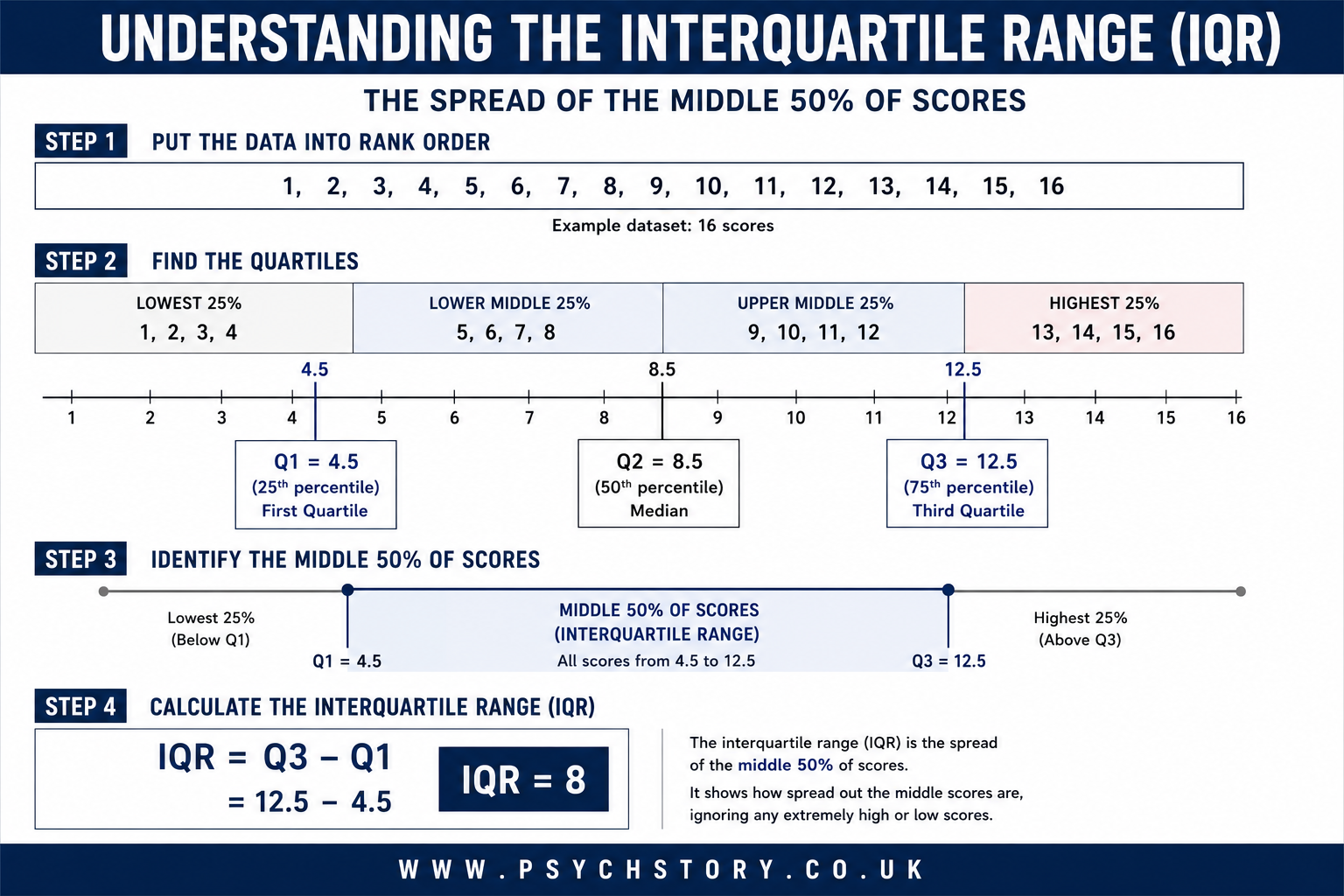
HOW TO CALCULATE THE INTERQUARTILE RANGE
The calculation of the IQR follows a clear sequence of steps.
The first step is to arrange all scores in rank order from lowest to highest. This is essential: quartiles cannot be identified from unordered data.
The second step is to find the median of the entire dataset, which becomes Q2. If the dataset contains an odd number of scores, the median is simply the middle value. If it contains an even number of scores, the median is the mean of the two middle values.
The third step is to divide the dataset into a lower half and an upper half, using the median as the dividing point. If the dataset has an odd number of scores, the convention at A Level is to exclude the median itself from both halves.
The fourth step is to find the median of the lower half. This value is Q1, the first quartile.
The fifth step is to find the median of the upper half. This value is Q3, the third quartile.
The sixth and final step is to subtract Q1 from Q3.
IQR = Q3 − Q1
To illustrate, consider the following dataset of 17 scores arranged in rank order: 3, 4, 5, 6, 7, 8, 9, 10, 11, 12, 13, 14, 15, 16, 17.
The median of this dataset is 10, the eighth value, which sits precisely in the middle. The lower half consists of the seven values below the median: 3, 4, 5, 6, 7, 8, 9. The median of this lower half is 6, which is therefore Q1. The upper half consists of the seven values above the median: 11, 12, 13, 14, 15, 16, 17. The median of this upper half is 14, which is therefore Q3.
The interquartile range is Q3 − Q1 = 14 − 6 = 8.
This result means that the middle 50% of scores in this dataset span a range of 8 points, from 6 to 14. Whatever values fall below 6 or above 14 — the outermost quarters — have played no part in that calculation.
ADVANTAGES OF THE INTERQUARTILE RANGE
The primary advantage of the interquartile range is its resistance to the distorting influence of outliers. Because the calculation is anchored to Q1 and Q3 rather than the minimum and maximum values, extreme scores cannot inflate or deflate it. A dataset with one extraordinarily high score will have the same IQR as an otherwise identical dataset without it, provided that the high score falls above Q3, which it will, almost by definition, if it is genuinely extreme. This property makes the IQR particularly well-suited for use alongside the median. Both the median and the IQR describe the central portion of the data without being pulled towards the extremes, and for this reason, they are used together as a pair: the median reports the centre of the distribution and the IQR reports the spread around it. Just as the mean and standard deviation work together, so do the median and IQR — and for the same reason. When a dataset contains outliers or is skewed, the median and IQR provide a more accurate description of the typical score and its variability than the mean and range. The IQR is also straightforward to interpret. A small IQR indicates that the middle half of the scores were tightly bunched together; a large IQR indicates that those scores were more widely dispersed. This is immediately meaningful without requiring any sophisticated statistical knowledge.
DISADVANTAGES OF THE INTERQUARTILE RANGE
The interquartile range's greatest strength is also, in a sense, its limitation. Deliberately excluding the top and bottom 25% of scores discards information. In some research contexts, those extremes are precisely what the researcher is interested in. If a study is examining performance under stress, for instance, the outlying scores — the participants who performed dramatically better or worse than everyone else — may be the most theoretically significant data points in the entire dataset. An IQR calculated from such data would describe the middling majority while entirely ignoring the most informative cases. The IQR is also less mathematically tractable than the standard deviation, meaning it does not feature in more advanced inferential statistical tests in the way that variance-based measures do. Researchers who intend to conduct parametric analyses will ultimately need to work with the mean and standard deviation rather than the median and IQR, so the latter pair, while useful for describing and summarising data, sits somewhat outside the mainstream of hypothesis testing. Finally, as with the median itself, the IQR can occasionally be misleading when datasets are very small. With only a handful of scores, the quartile boundaries may not represent stable or meaningful divisions, and the resulting IQR should be interpreted cautiously.
THE STANDARD DEVIATION
In the previous section, distribution curves were used to show how scores arrange themselves around a central value — whether that arrangement produces the symmetrical bell shape of a normal distribution or the lopsided profile of a skewed one. Those curves are not freehand sketches or rough impressions. They are precise graphical representations, and their exact shape — how tall, how wide, how symmetrical — is determined entirely by the pattern of the raw data from which they are drawn. The position of the peak, the steepness of the slopes, and the spread of the tails are all mathematical consequences of what the data actually contains.
A distribution curve, however, can only show spread visually. It can reveal whether scores are clustered tightly or dispersed widely, but it cannot produce a single number that captures exactly how much variability exists. That is the purpose of the standard deviation, and understanding what it actually measures is the foundation for everything that follows. The standard deviation is a measure of spread. More precisely, it measures the typical distance between individual scores and the dataset's mean. To understand what this means in practice, consider what happens when any set of scores is collected. Some participants will score very close to the mean, some will score somewhat above it, and some will score somewhat below it. Each of those scores sits at a certain distance from the mean — some distances will be small, some will be larger. The standard deviation takes all of those individual distances into account and produces a single value that represents the typical size of the gap between a score and the mean. It is, in essence, an average of how far scores tend to stray from the average. This is why the standard deviation is so informative. A small standard deviation indicates that most scores are close to the mean — the typical distance between a score and the average is small, meaning participants responded in broadly similar ways. A large standard deviation indicates that scores were more widely dispersed — the typical distance between a score and the mean was large, indicating considerable variability in how participants responded.
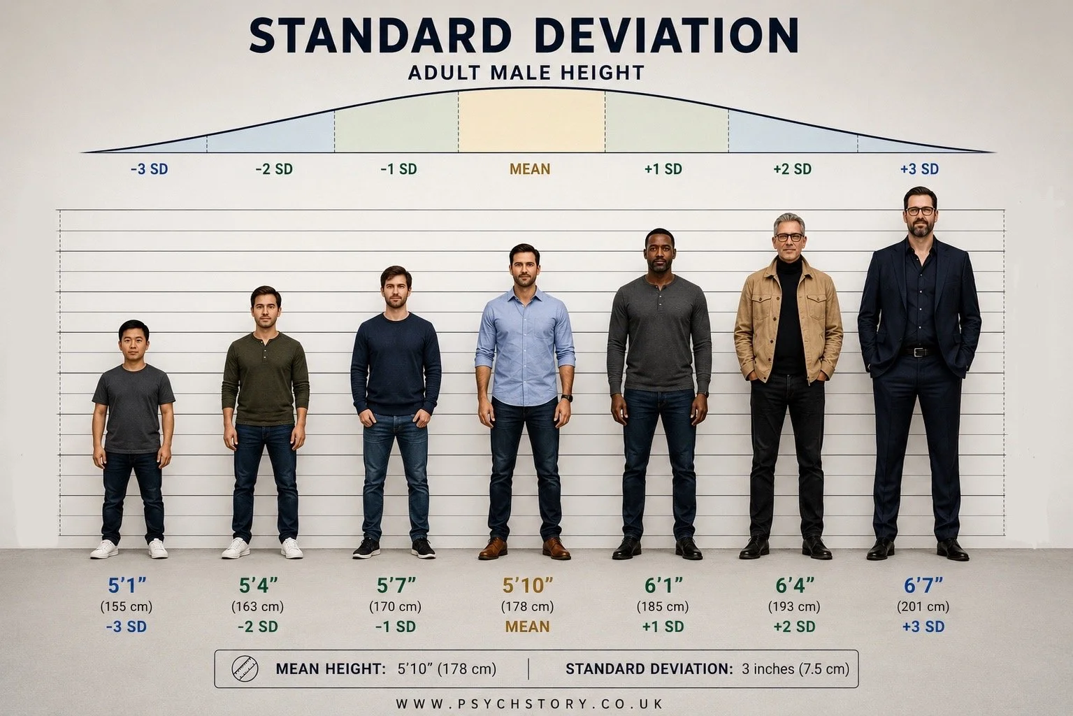
A concrete example makes this easier to grasp. Consider shoe sizes among adult women in the United Kingdom. The mean shoe size is approximately a size 6. Most women wear something close to that — a 5, a 6, or a 7 — and relatively few wear a size 3 or a size 9. Because the majority of scores cluster tightly around the mean, the standard deviation is small. Now consider something far more variable, such as the amount of time different women spend exercising each week. Some may do none at all, others may train for many hours. The scores are scattered across a very wide range, and the typical distance between any individual score and the mean is therefore large. The standard deviation would be large accordingly. Both datasets have a mean, but the mean alone would not reveal how differently those two datasets are structured. The standard deviation does. The distribution curve may show this visually in the width of its shape, but the standard deviation is what allows that spread to be stated precisely, compared across studies, and used in further statistical analysis. That combination of clarity and precision is what makes it one of the most important and widely used statistics in psychological research
THE SIZE OF THE STANDARD DEVIATION MATTERS
Standard deviation is like a measuring tape for how spread out the numbers are in a data set. Imagine you have many points on a line. If they’re all huddled close together, there’s not much difference between them, so the standard deviation is small. But if they’re scattered all over the place, far from each other, then the standard deviation is large because there’s a lot of variety in the numbers.
It’s a way to see how much the scores differ from the average or the “normal” amount. So if everyone in your class scores similarly on a test, the standard deviation will be low. But if the scores are all over the map, the standard deviation will be high, showing a big range in how everyone did.
The size of the standard deviation tells us how consistent or variable the scores are.
A small standard deviation means the scores are tightly clustered around the mean. Most participants gave very similar ratings, so the data is highly consistent. For example, if all 20 students in a class scored between A and A* on a test, the standard deviation would be small.
A large standard deviation means the scores are widely spread out. Some participants gave very high ratings while others gave very low ratings, showing low consistency and high variability. For example, if the same 20 students scored anywhere from A* down to a U, the standard deviation would be large.
When the results are tightly grouped around the mean, the bell-shaped curve is steep and narrow, and the standard deviation is small. When the results are widely spread, the bell curve is relatively flat and wide, and the standard deviation is large.
In short, the standard deviation does not just tell us the average spread — it tells us how reliable or predictable the results are. A small SD suggests the findings are fairly stable across participants, whereas a large SD indicates the results are more variable and less consistent.
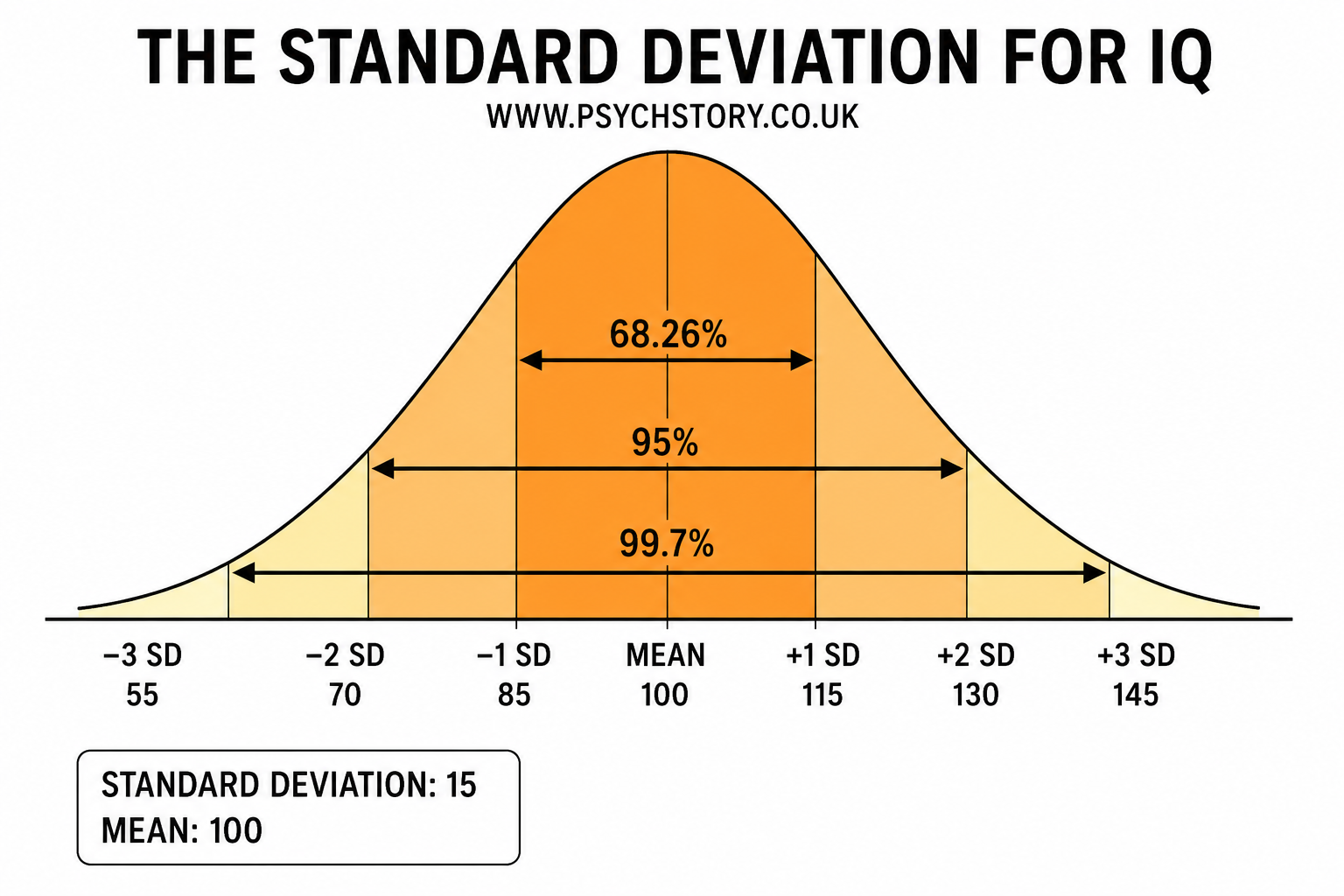
WHAT IQ TEST SCORES MEANWHAT IQ TEST SCORES MEAN
IQ tests are usually standardised with a mean of 100 and a standard deviation of 15. The scores below are based on the most commonly used classifications (e.g., Wechsler scales). Percentages show roughly what proportion of the population falls into each range.
145 and above – Very Gifted / Highly Advanced (less than 0.1% of the population). This is the range often associated with exceptional intellectual ability. Historical estimates for figures like Albert Einstein are around 160. Claims of extremely high scores (such as Marilyn vos Savant at 228 or Ainan Cawley at 263) are controversial, often based on non-standard or unverified testing methods, and are not widely accepted by psychologists.
130–144 – Very Superior (approximately 2.1% of the population). This level is typical of many scientists, inventors, and highly accomplished professionals.
120–129 – Superior (approximately 6.4% of the population). Many people with PhDs or professional doctorates (e.g., MDs) have IQs in or near this range. 125 is sometimes cited as an approximate average for those holding advanced doctoral degrees.
111–119 – High Average (approximately 15.7% of the population). 111–115 is often cited as the average IQ range for students who successfully complete A-levels.
90–110 – Average (approximately 51.6% of the population). This is the middle range for the general population, with 100 being the exact mean.
80–89 – Low Average (approximately 13.7% of the population)
70–79 – Borderline / Educational Needs (approximately 6.4% of the population). At an IQ of around 75, there is roughly a 50% chance of successfully reaching Year 9 (KS3) without significant additional support.
Below 70 – Extremely Low / Intellectual Disability (approximately 2.3% of the population). This range indicates a significant intellectual disability. For example, the average IQ for individuals with Down syndrome is typically between 30 and 70.
Below 20–25 – Profound Intellectual Disability People in this range often have profound and multiple learning difficulties, frequently combined with physical disabilities, sensory impairments, and complex medical needs. They require substantial lifelong support.
FOOTNOTES:
Percentiles are approximate and based on the normal distribution.
"Genius" is not an official clinical category on modern IQ tests (Wechsler, Stanford-Binet, etc.). Terms like "Very Superior" or "Highly Gifted" are preferred.
Extremely high IQ claims (228, 263) are widely disputed and generally considered unreliable by most psychologists.
Average IQ for PhDs/MDs is typically reported in the 115–125 range
HOW DO WE ANALYSE THE STANDARD DEVIATION GRAPH?
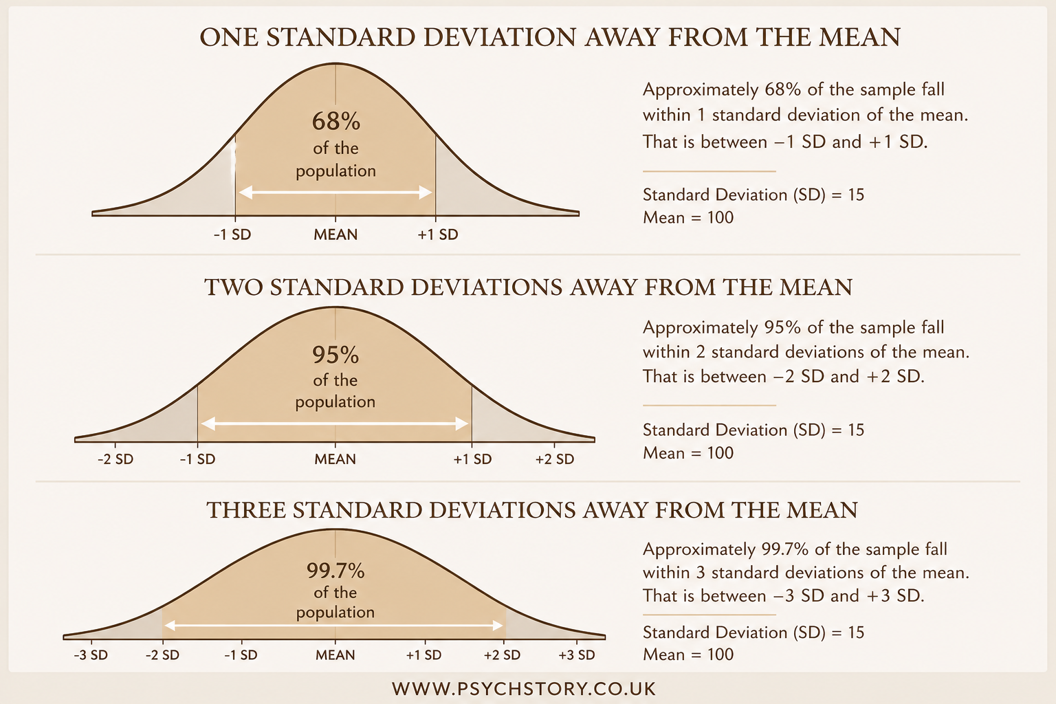
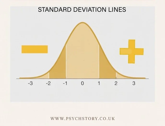
The graph representing standard deviation always takes the form of a symmetrical bell-shaped curve. The reason for this is straightforward: the standard deviation is a measure that only makes full sense when applied to a normal distribution. It is calculated from the mean, and the mean is only a truly representative measure of central tendency when scores are distributed symmetrically around it. If the distribution were skewed, the mean would be pulled towards the tail, and the standard deviation would be measuring spread around a centre point that does not accurately reflect the dataset. For this reason, standard deviation and the normal distribution go hand in hand — one assumes the other. Marked onto this curve are seven vertical lines. The central line sits at the peak of the curve and represents the mean. It is the anchor point from which everything else on the graph is measured. The remaining six lines are arranged in three pairs, extending outward from the mean in both directions towards the tails of the distribution.
The first pair of lines — immediately to the left and immediately to the right of the mean — represents one standard deviation from the mean. These two lines are equidistant from the centre and together enclose a region of the curve that captures 68% of all scores. Just over two-thirds of participants, in other words, scored within one standard deviation of the mean. Returning to the shoe size example, if the mean is a size 6 and the standard deviation is one size, then 68% of women will wear between sizes 5 and 7.
The second pair of lines, further out from the centre, represents two standard deviations from the mean. The region between these lines captures 95% of all scores. Only 5% of scores lie beyond this point, out in the tails where the curve has flattened considerably. The third and outermost pair represents three standard deviations from the mean, enclosing 99.7% of all scores. Scores beyond this boundary are exceptionally rare and represent genuine statistical outliers. The curve at this point has tapered to almost nothing, reflecting just how few participants produce scores this far from the average.
SUMMING UP THE THREE STANDARD DEVIATION LINES
SDs CALCULATE DISTANCE FROM THE MEAN: They act as clear markers for how unusual or extreme a score is. For example, eating 12 meals per day would be far outside the normal range for most people, so you would not expect to find that result clustered around the mean. It would sit way out in the tail of the distribution.
IT TELLS US THE EXCAT PERCENTAGE OF SCORES AT EACH SD: Unlike the range, which only tells us the difference between the highest and lowest score, standard deviation lines tell us the percentage of scores that fall within certain distances from the mea For example, if the results in a class range from 0 to 100, the range alone cannot tell us whether one person scored 100 and everyone else scored low, or whether nearly all students scored highly. With standard deviation, we can see exactly how the scores are spread out around the mean
When data follows a normal distribution, the standard deviation lines on the bell curve tell us exactly what percentage of the scores fall within certain distances from the mean. These percentages are always consistent:

ADDING AND SUBTRACTING THE SD TO THE GRAPH POINTS
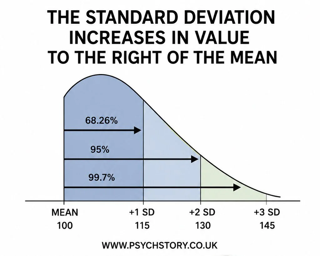
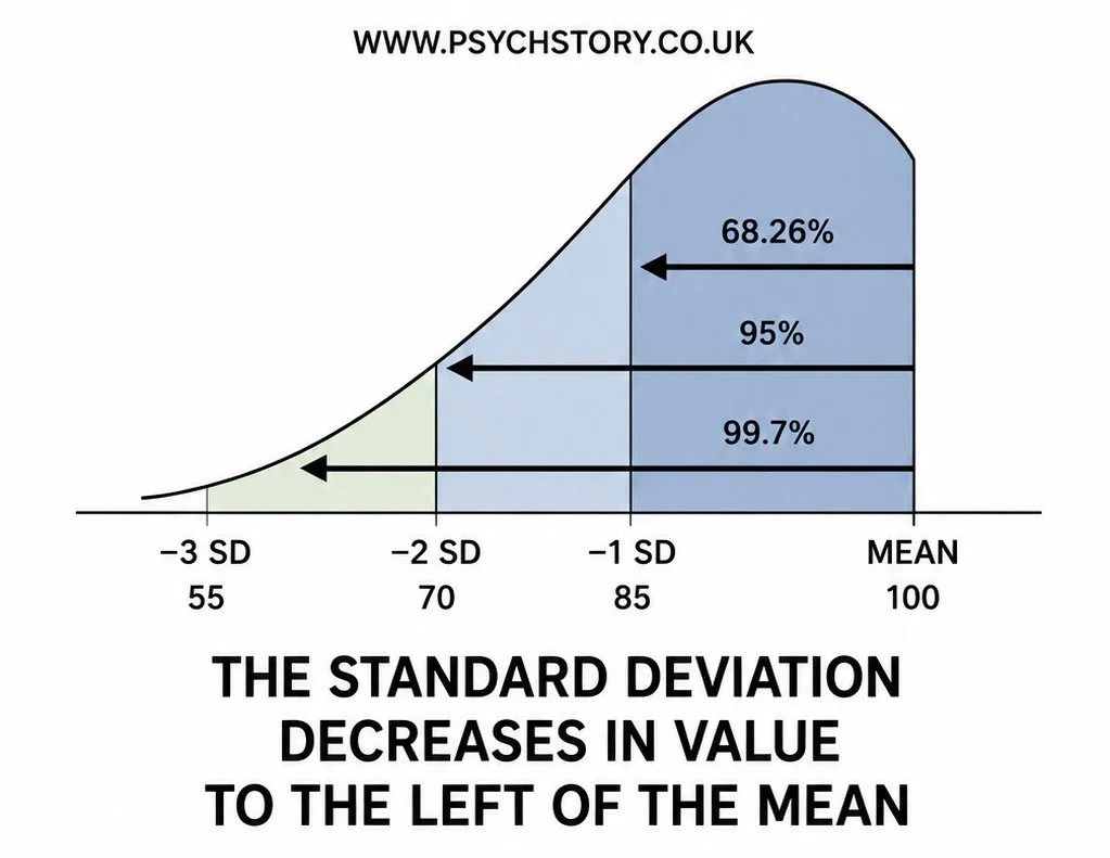
Standard deviation becomes much easier to understand once it is plotted onto a normal distribution. To do this, statisticians need two pieces of information: the mean and the standard deviation. The mean is placed at the centre of the distribution because it represents the average score. For example, the average IQ score is 100, so 100 would be placed on the central line of the graph. Next, the standard deviation value is needed. For IQ tests, the standard deviation is 15. This means that scores typically vary by about 15 points from the mean. To plot one standard deviation on the graph, 15 is added to the mean on one side and subtracted from the mean on the other: In other words, on one side of the standard deviation, the standard deviation increases and on the other side, it decreases.
PLOTTING STANDARD DEVIATION ON A BELL CURVE
Once you have calculated the standard deviation, you only need two pieces of information to plot it on a normal distribution curve: the mean and the standard deviation. For example, with IQ scores, the mean is 100 and the standard deviation is 15. You place the mean at the centre peak of the bell curve. Then you subtract the standard deviation from the left of the mean and add it to the right of the mean:
Mean – 1 SD = 100 – 15 = 85
Mean + 1 SD = 100 + 15 = 115
This shows that 68% of scores fall between 85 and 115, 95% between 70 and 130, and 99.7% between 55 and 145. With just the mean and the standard deviation, you can mark the intervals clearly on the bell curve by subtracting the SD to the left and adding it to the right
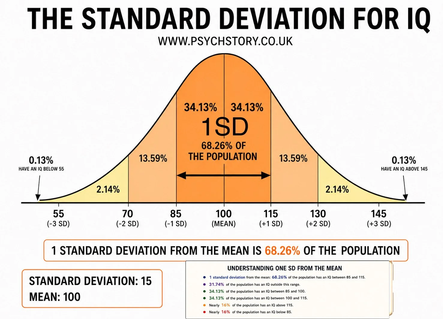
±1 standard deviation from the mean contains approximately 68.26% of the population/scores
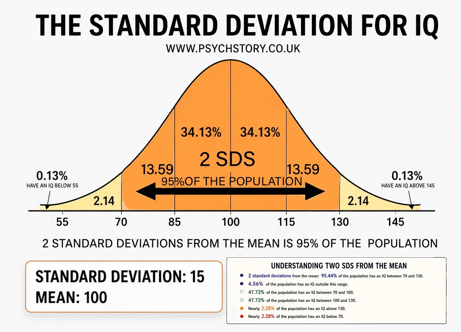
±2 standard deviations from the mean contains approximately 95.4% of the population/scores

±3 standard deviations from the mean contains approximately 99.7% of the population/scores
*Footnote: These figures are often remembered in a simplified, rounded form as 68%, 95%, and roughly 99% for the third line when working quickly in exams
ADVANTAGES AND DISADVANTAGES OF THE STANDARD DEVIATION
The standard deviation has several significant advantages that explain why it is the most widely used measure of spread in psychological research. Most importantly, it takes into account every score in the dataset. Unlike the range, which is determined solely by the two most extreme values, the standard deviation is calculated from the distance between each individual score and the mean. This makes it a far more sensitive and representative measure of variability because no score is ignored, and no single outlier can distort the result as it can with the range.
The standard deviation is also considerably more informative than other measures of spread because of what it enables researchers to do once calculated. As the previous section demonstrated, plotting the standard deviation onto a normal distribution allows researchers to determine exactly what percentage of scores fall within any given distance from the mean. This transforms the standard deviation from a simple summary statistic into a genuinely analytical tool — one that allows precise statements about how typical or unusual any particular score is. A further advantage is that the standard deviation is used in many advanced statistical tests that researchers rely on when analysing data. Parametric tests, which are the most powerful and widely used statistical procedures in psychology, require measures based on the mean and standard deviation. A researcher who has calculated the standard deviation of their data is therefore well-placed to move on to inferential statistical analysis.
The standard deviation is not without its limitations, however. Because it is calculated from the mean, it shares the mean's central weakness: sensitivity to outliers. A single extreme score will inflate the mean, and an inflated mean will in turn produce larger distances between scores and the average, pushing the standard deviation upward. In a dataset with outliers, the standard deviation may overstate the typical variability among most scores, giving a misleading impression of how spread out the data actually is. This sensitivity means that the standard deviation is most appropriate for normally distributed datasets free of extreme values. When data is skewed or contains outliers, the median and interquartile range provide a more accurate description of the data, precisely because they are not influenced by extreme values. The standard deviation, powerful as it is, should always be interpreted with an awareness of the shape of the distribution it is describing.
EXAM QUESTION ON THE STANDARD DEVIATION OF GROUPS VERSUS INDIVIDUALS
A psychologist believed that people generate more new ideas on their own than in groups, and that the belief that people are more creative in groups is false. To test this idea, he arranged for 30 people to participate in a study to generate ideas for boosting tourism. Participants were randomly allocated to one of two groups. Fifteen of them were asked to work individually and generate as many ideas as possible to boost tourism in their town. The other fifteen participants were divided into three groups, and each group was asked to "brainstorm" to generate as many ideas as possible to boost tourism in their town. The group "brainstorming” sessions were recorded, and the number of ideas generated by each participant was noted. The psychologist used a statistical test to determine whether there was a significant difference in the number of ideas generated by participants working alone versus in groups. A significant difference was found at the 5% level for a two-tailed test (p ≤ 0.05).”
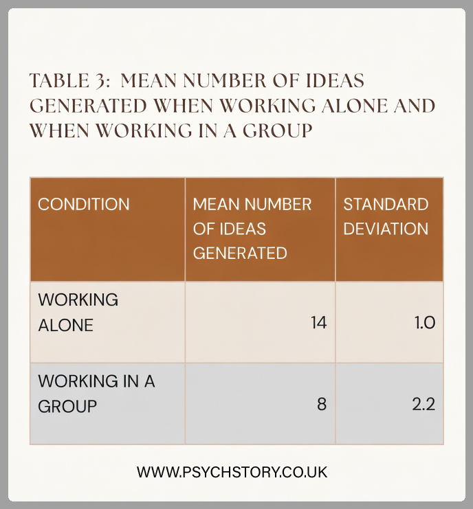
EXAM ADVICE ON THE STANDARD DEVIATION
Concerning the data in Table 3, outline and discuss the findings of this investigation. (10 marks)AO1 = 3-4 marks and AO2/3 = six marks: Exam hint: Questions about interpreting standard deviation values are often worth several marks, so linking your answer to the question, rather than just pointing out how they differ, is essential. Tell the examiner what these scores tell you about the data!
ESSAY ADVICE A01
AO1 = 3-4 marks: Outline the findings of the investigation
STEP 1: Look at the means
Participants working alone produced a mean of 14 ideas.
Participants working in groups produced a mean of 8 ideas.This shows that, on average, individuals working alone generated almost twice as many ideas as those working in groups.
STEP 2: Work out and interpret the standard deviations
You only need two numbers: the mean and the standard deviation.
You then move outwards from the mean in both directions.
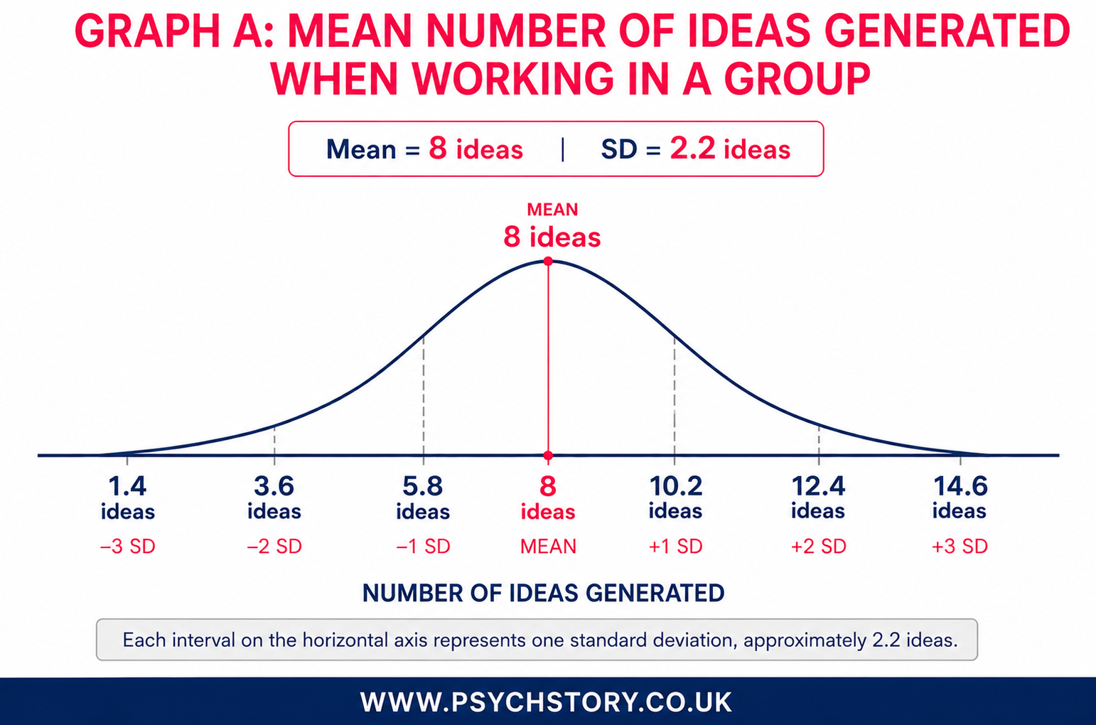
GRAPH A: WORKING IN A GROUP
STANDARD DEVIATION = 2.2
MEAN = 8
RIGHT SIDE
8 + 2.2 = 10.2 (1 SD)
10.2 + 2.2 = 12.4 (2 SD)
12.4 + 2.2 = 14.6 (3 SD)
LEFT SIDE
8 − 2.2 = 5.8 (1 SD)
5.8 − 2.2 = 3.6 (2 SD)
3.6 − 2.2 = 1.4 (3 SD)
THIS MEANS
68% of participants scored between 5.8 and 10.2 ideas
95% of participants scored between 3.6 and 12.4 ideas
99.7% of participants scored between 1.4 and 14.6 ideas
This is a much wider spread. Some participants produced very few ideas, while others produced many more.
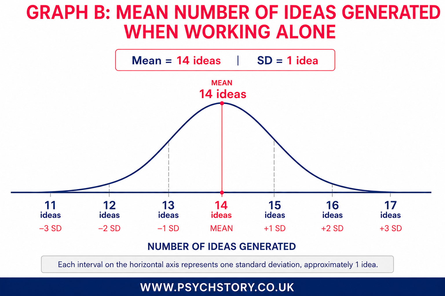
GRAPH B WORKING ALONE
STANDARD DEVIATION = 1
MEAN = 14
RIGHT SIDE
14 + 1 = 15 (1 SD)
15 + 1 = 16 (2 SD)
16 + 1 = 17 (3 SD)
LEFT SIDE
14 − 1 = 13 (1 SD)
13 − 1 = 12 (2 SD)
12 − 1 = 11 (3 SD)
THIS MEANS
68% of participants scored between 13 and 15 ideas
95% of participants scored between 12 and 16 ideas
99.7% of participants scored between 11 and 17 ideas
This is a very tight spread. Most participants produced a very similar number of ideas.
EXEMPLAR ANSWER TO THE GENERATING IDEAS QUESTION (A02/A03)
In the ‘working alone’ condition, the mean number of ideas generated was 14, compared with a mean of only 8 in the ‘working in a group’ condition. This means that participants working alone generated almost twice as many ideas as participants working in groups. On the surface, this appears to support the psychologist’s hypothesis that people generate more ideas when working alone than when brainstorming in groups.
However, the mean alone does not tell the whole story. Means can sometimes be distorted by extreme scores. For example, a few participants in the working alone condition may have generated a very large number of ideas, thereby increasing the mean. Equally, one particularly weak group may have produced very few ideas, lowering the mean for the group condition. Therefore, it is important to examine the standard deviations as well.
The standard deviation (SD) tells us how much variation there is in scores around the mean. In other words, it tells us what percentage of participants scored similarly to the mean and what percentage scored very differently. In the working alone condition, the SD was 1.0, whereas in the working in a group condition, it was 2.2. The smaller the SD, the more similar participants’ scores are to one another. This instils confidence that the independent variable may have affected the dependent variable, as most participants responded similarly.
In the working alone condition, approximately 68% of participants generated between 13 and 15 ideas (14 ± 1). In contrast, approximately 68% of participants in the group condition generated between 5.8 and 10.2 ideas (8 ± 2.2). This means that participants working alone deviated only slightly from the mean score of 14. Most participants, therefore, generated a similar number of ideas. In contrast, there was much more variation in the group condition, suggesting that some groups generated many ideas, whereas others generated very few. Therefore, participants working alone not only generated more ideas on average but also had much more predictable and consistent performance.
This is important because differences in the standard deviations across experimental conditions suggest that participants did not respond to the conditions in the same way. This could mean one of two things. Firstly, the hypothesis may be correct and working alone genuinely aids idea generation. Alternatively, the group condition may have lacked internal validity, meaning that factors other than the independent variable influenced performance.
There are several possible reasons for the larger variation in the group condition. For example, the study did not control for personality variables such as extroversion and introversion. As a result, some groups may have included dominant members who controlled the discussion and limited other participants’ contributions, whereas others may have encouraged equal participation. Some participants may also have been reluctant to contribute ideas because they feared criticism from the rest of the group, a phenomenon known as evaluation apprehension.
Secondly, the researchers did not operationalise what constituted an idea. Some groups may have spent time deliberating whether a suggestion was worth including, prioritising quality over quantity and, as a result, putting forward fewer ideas. In contrast, participants working alone may have listed every idea that came to mind because nobody was present to challenge or evaluate their suggestions. As a result, they may have processed the task more quickly and produced more ideas overall, prioritising quantity over quality. In other words, Did the researchers just accept all ideas regardless of quality? If so, then they were not really testing creativity? From the study, it appears that they were testing the quantity of ideas, regardless of whether they were operationalised.
The researchers should therefore have provided a clearer operational definition of what counted as an idea. Without this, it is difficult to know whether the study was measuring the quantity of ideas, the quality of ideas, or creativity itself. These differences in group dynamics and task interpretation could explain why the group condition produced much more variable results.
APPLIED EXAMPLE OF A STANDARD DEVIATION
COMPARING SLIMMERS’ WORLD AND WEIGHT WATCHERS’ DIETS
IMAGINE THE FOLLOWING SCENARIO
You are looking to shed a few pounds and have heard that joining a support group, such as Weight Watchers or Slimming World, significantly increases your chances of success. But faced with the choice, which one do you pick? Naturally, you want to join the group with the most impressive outcomes. Embracing your inner statistician, you request descriptive statistics to verify their success stories and obtain weight-loss data from 5,000 dieters over a three-month period. The results are presented in Table 4 below.
Observe the three tables below and answer the following question:

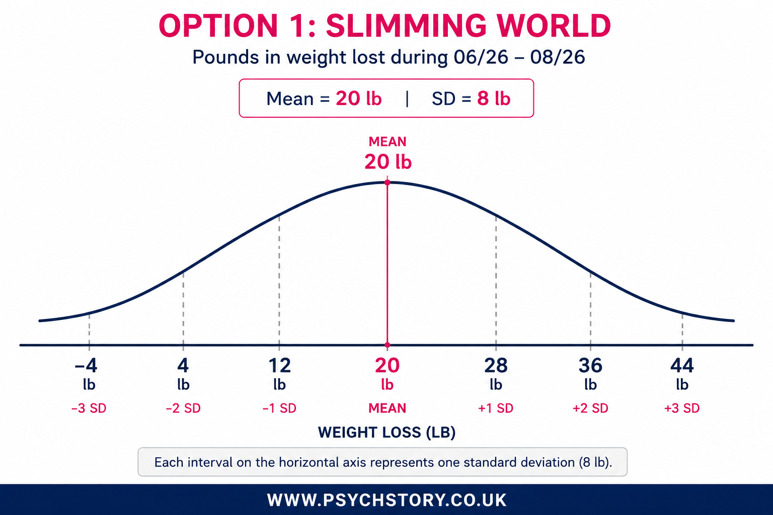
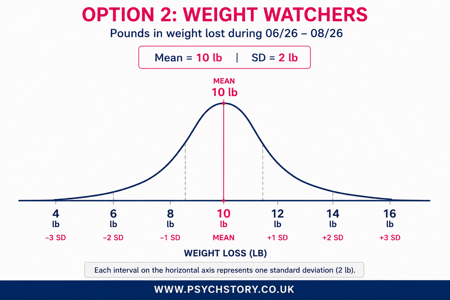
*Disclaimer: Please be aware that the data provided above is entirely fictional, and I possess no knowledge of the actual performance, success, or failure rates of Weight Watchers or Slimming World. Nonetheless, it's worth noting that participating in a support group is generally advantageous.
QUESTIONS ON SLIMMER’S WORLD AND WEIGHT WATCHERS
Approximately 68% of Slimming World participants lost between which two values?
Approximately 95% of Weight Watchers participants lost between which two values?
Approximately 99% of Weight Watchers participants lost between which two values?
Approximately 99% of Slimming World participants lost between which two values?
What scores represent one standard deviation above and below the mean for Slimming World?
What scores represent two standard deviations above and below the mean for Slimming World?
What scores represent three standard deviations above and below the mean for Slimming World?
What scores represent one standard deviation above and below the mean for Weight Watchers?
What scores represent two standard deviations above and below the mean for Weight Watchers?
What scores represent three standard deviations above and below the mean for Weight Watchers?
Which programme produced the greater average weight loss?
Which programme produced the most consistent results?
What was the minimum weight loss achieved in the Weight Watchers group?
What does the negative value on the Slimming World distribution represent?
Which programme showed the greater variability in outcomes?
What does the larger standard deviation of Slimming World tell us about the spread of scores?
What information does the standard deviation provide that the mean alone cannot?
How could the standard deviation help you decide which programme was more effective?
A friend claims that Slimming World is automatically the better programme because the mean weight loss is higher. Evaluate this claim.
Which programme appears to have greater internal validity? Explain your answer.
Having considered both the mean and the standard deviation, which diet would you choose and why?
Concerning the data in Table 4, outline and discuss the findings of this investigation. (10 marks)AO1 = 3-4 marks and AO2/3 = six marks: Exam hint: Questions about interpreting standard deviation values are often worth several marks, so linking your answer to the question, rather than just pointing out how they differ, is essential. Tell the examiner what these scores tell you about the data!
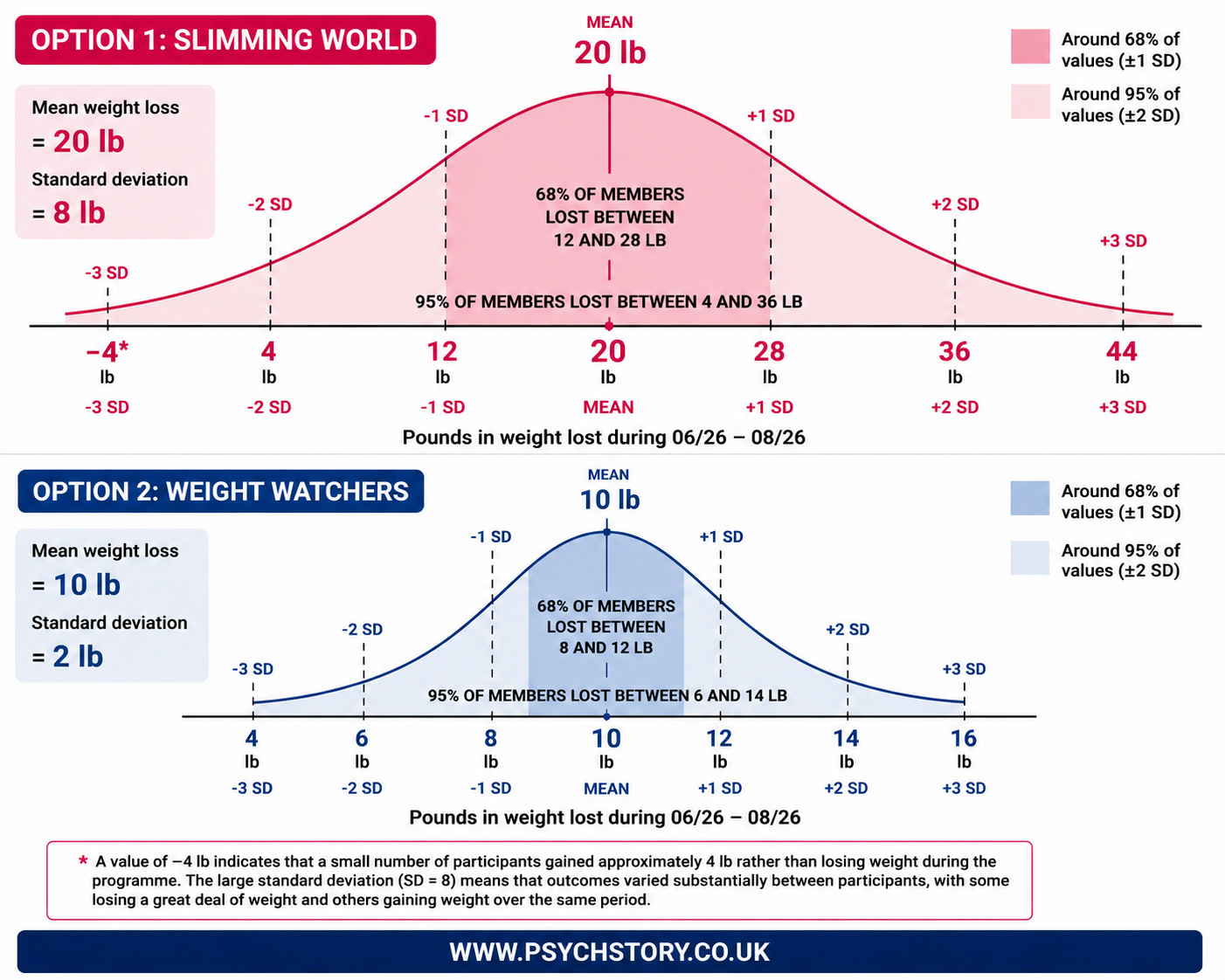
ANSWERS TO SLIMMERS’ WORLD AND WEIGHT WATCHERS' QUESTIONS
The mean weight loss for Slimming World was 20 lb, compared with 10 lb for Weight Watchers. On the surface, this suggests that Slimming World was the more effective programme, with participants losing twice as much weight on average. However, the mean alone does not tell the whole story. Means can sometimes be distorted by extreme scores. Therefore, it is important to examine the standard deviations as well.
The standard deviation (SD) tells us how much variation there is in scores around the mean. In other words, it tells us what percentage of participants achieved similar results and what percentage achieved very different results. Slimming World had a standard deviation of 8 lb, whereas Weight Watchers had a standard deviation of only 2 lb. The smaller SD for Weight Watchers suggests that participants tended to achieve similar levels of weight loss. In contrast, the larger SD for Slimming World indicates much greater variation in outcomes. The SD also allows us to estimate where most participants scored. In the Slimming World condition, approximately 68% of participants lost between 12 and 28 lb (20 ± 8). In contrast, approximately 68% of participants in Weight Watchers lost between 8 and 12 lb (10 ± 2). Looking further at the distribution, approximately 95% of Slimming World participants lost between 4 and 36 lb, whereas approximately 95% of Weight Watchers participants lost between 6 and 14 lb.
If we extend this to three standard deviations, approximately 99.7% of Slimming World participants scored between approximately -4 lb and 44 lb. This means that a small number of participants actually gained weight rather than losing it, whilst others lost very large amounts of weight. In contrast, approximately 99.7% of Weight Watchers participants scored between 4 lb and 16 lb, showing much greater consistency in outcomes. This difference in variability is important because there are two possible explanations. Firstly, Slimming World may genuinely be the more effective programme. If this explanation is correct, the higher mean reflects greater weight loss, and the larger standard deviation reflects that some participants benefit enormously from the programme, whilst others benefit more modestly.
Alternatively, the difference may not be due entirely to the diets themselves. The larger standard deviation may suggest that other variables associated with the programmes influenced participants' weight loss. For example, Slimming World may have more experienced group leaders, more effective support meetings, or greater encouragement from other members. Similarly, one programme may provide foods that are easier to obtain from supermarkets or easier to incorporate into everyday life. If so, differences in weight loss may be due to aspects of the programmes rather than the diets themselves.
Therefore, the means and standard deviations should be interpreted together. The mean suggests that Slimming World produced greater overall weight loss, whilst the standard deviation suggests that outcomes varied considerably among participants. This may indicate that Slimming World genuinely produces a wider range of outcomes, or that confounding variables associated with the programme influenced participants differently. Further research would be needed to determine which explanation is correct