LEVELS OF MEASUREMENT
To understand “Levels of measurement”, you must know the distinction between DISCRETE AND CONTINUOUS DATA. If you are unsure of these terms, please click here
NOT ALL DATA IS CREATED EQUALLY
LEVELS OF MEASUREMENT: Not all data is created equally. Some data is genuinely mathematical, while other data only appears mathematical because researchers have converted something that has no mathematical meaning, like an opinion, into a numerical form. To put it more formally, some data represent precise measurements, while other forms merely assign numbers to subjective views or categories. To understand this distinction more clearly, consider the difference between objective measurement and subjective opinion.
OBJECTIVE MEASUREMENT: A room’s temperature is measured at 20°C. A thermometer can verify this value precisely. Any observer using the same instrument will obtain the same reading. The measurement reflects a physical property of the environment and does not depend on personal feelings or interpretations. This type of data is objective because it is observable, measurable, and independently verifiable. Examples include height, weight, reaction time, and temperature. These measurements produce quantitative data, which can be meaningfully analysed using mathematical procedures.
SUBJECTIVE OPINION: Now consider how people might feel about the room temperature. Person A may feel that the room is too cold, while Person B finds it comfortable. The objective temperature is identical for both individuals, yet their experiences differ. These responses represent subjective data because they are based on personal perceptions, emotions, and preferences. Such data often appear in psychological research when participants are asked to rate experiences, attitudes, or feelings. For example, an individual might be asked to rate the attractiveness of an actor on a scale from 0 to 10. If two people both assign Johnny Depp a rating of 9, this does not imply that their evaluations are equivalent. The number reflects a subjective judgement rather than a standardised unit of measurement, so each person may be expressing a different level of preference despite using the same rating. In addition, the numerical intervals on such a scale are not uniform or objectively defined. The difference between ratings of 8 and 9 is not necessarily equal to the difference between 9 and 10. The numbers function as labels for subjective impressions rather than precise, quantifiable distances.In practice, such values function more like categories or verbal descriptors than true measurements. A participant could just as easily express the same judgement using terms such as “very attractive,” “quite attractive,” or “moderately attractive.” The use of numbers is primarily a methodological convenience, allowing responses to be coded and analysed statistically. However, assigning numerical values does not convert the underlying judgement into an objective, standardised measure. The same issue arises when individuals are asked to rate their happiness on a scale from 1 to 10. Each person applies their own internal standard, shaped by prior experience, expectations, and current mood. As a result, identical numerical ratings may reflect very different subjective states, meaning the scale captures personal evaluation rather than a precise, comparable quantity
SUBJECTIVE AND OBJECTIVE DATA IN RESEARCH: Subjective data captures personal perspectives and experiences. It is valuable for understanding attitudes, emotions, and perceptions, but it lacks the precision and standardisation of objective measurement. Objective data, by contrast, refers to measurable and verifiable observations that can be independently confirmed. Examples include height measured in centimetres, reaction time in milliseconds, or heart rate in beats per minute. These values represent consistent properties of the phenomenon being studied and are not dependent on individual interpretation. Because objective measurements are standardised, the numerical values carry consistent meaning across participants. A given unit represents the same quantity in every case, and the intervals between values are uniform. This allows researchers to treat the data as true quantitative variables, where differences between scores are interpretable and comparable. As a result, more powerful statistical techniques can be used. Researchers can calculate meaningful averages, variances, and correlations, and can apply parametric tests that assume equal intervals and consistent measurement. These analyses allow more precise estimation of relationships, stronger inferences, and greater confidence in the reliability and validity of the findings.
IMPORTANCE OF DATA ANALYSIS: Understanding the distinction between subjective opinions and objective measurements is fundamental in research methods. The type of data collected determines which statistical procedures are appropriate and how confidently conclusions can be drawn. Data that merely classifies or ranks responses may require simpler statistical methods, while data derived from precise measurement allows more robust mathematical analysis. For this reason, quantitative data that represents genuine measurement is often regarded as higher in precision and reliability, whereas data derived from subjective judgements must be interpreted with greater caution
WHAT ARE THE DIFFERENT LEVELS OF MEASUREMENT?
In statistics, levels of measurement are simply a way of asking a basic question: what kind of data do I have? Different types of data allow different kinds of analysis. Some data can only be placed into categories, while other data can be measured precisely and analysed mathematically. Levels of measurement help researchers distinguish among these forms of data by their precision, mathematical properties, and methods of collection. In other words, levels of measurement are a system used to organise data into categories based on the amount of information they contain and the statistical operations that can legitimately be applied to them.
There are four main categories of data.
NOMINAL
ORDINAL
INTERVAL
RATIO
These four scales were introduced by the psychologist Stanley Smith Stevens in 1946. Stevens proposed that data could be classified according to the mathematical properties they possess. Each level represents a different degree of measurement precision, which determines how the data can be analysed statistically. Stevens argued that identifying the correct level of measurement is essential because it determines which statistical tests are appropriate. Some statistical procedures require precise numerical measurement, while others can only be applied to categorical or ranked data. The four levels of measurement form a hierarchy of informational precision. As you move from nominal to ratio data, the amount of meaningful mathematical information increases. Each level contains the properties of the previous level but adds an additional feature that allows more sophisticated analysis. For this reason, the four levels are often viewed as representing a progression in measurement sophistication. Data at higher levels of measurement generally allows more powerful statistical techniques, because the numerical relationships between values are meaningful and consistent.
Understanding this hierarchy is important in research and data analysis because the level of measurement determines:
How data can be organised
What mathematical operations are meaningful
Which statistical tests can be legitimately used
How confidently can conclusions be drawn from the results
To determine the level of measurement (nominal, ordinal, interval, or ratio), ask the following two questions:
Are the gaps/differences between the categories mathematically equal and meaningful? (In other words: Are the intervals objective, consistent, and arithmetic — or are they subjective/arbitrary?)
Can the values be meaningfully ordered from smallest to largest? (Is there a clear, natural ranking?)
WHY THESE LEVELS FORM A HIERARCHY
The four levels of measurement form a hierarchy because each level adds an additional property.
Nominal data categorises information and counts frequencies
Ordinal data adds ranking.
Interval data introduces equal measurable distances.
Ratio data adds a true zero point.
As the level increases, the amount of meaningful mathematical information increases. This allows researchers to apply progressively more powerful statistical analyses and draw more precise conclusions from the data
THE FOUR LEVELS OF MEASUREMENT
NOMINAL DATA
NOMINAL DATA IN BRIEF
DESCRIPTION
Nominal data simply places things into categories. There is no order, ranking, or numerical meaning attached to the categories. The numbers, if used, are only labels. A relatable example is streaming platforms. If a group of students are asked which platform they mainly use, the responses might be:
Netflix
YouTube
TikTok
Disney+
These categories can be counted, but they cannot be ranked meaningfully. Netflix is not “greater than” TikTok in any numerical sense. The data simply records which category each person belongs to.
CONCRETE ILLUSTRATION OF NOMINAL DATA USING HAIR COLOUR AND PERSONALITY STEREOTYPES
A clear way to understand nominal data is through the following structured example. Suppose participants are asked whether there is an association between hair colour and personality traits. They are presented with categories of hair colour such as blonde, brown, black, red, grey, blue, and pink. They are then asked to indicate which personality traits they believe apply to each hair colour. These traits might include fiery, intelligent, promiscuous, academic, vegan, feminist, or friendly. This produces nominal data because both variables consist of separate categories rather than values that vary along a scale.
THE ABSENCE OF A CONTINUUM IN HAIR COLOUR Hair colour is a categorical variable. Blonde, brown, black, and red are distinct groups that are independent of one another. They cannot be arranged along a meaningful continuum. A continuum exists when a single variable can vary by degree, such as height, weight, or IQ. In those cases, values can be compared as “more” or “less,” and the difference between them has quantitative meaning. For example, the difference between an IQ score of 145 and 140 is the same as the difference between 60 and 55 because the scale has equal intervals. Hair colour does not work this way. Participants are not measuring the amount of “brownness” or “blondeness.” They are simply selecting a category. There is no meaningful sense in which brown is greater than blonde, or red lies between blonde and black. There is also no consistent or interpretable distance between any two colours — the difference between red and black is not equivalent to the difference between pink and grey, because no shared unit of measurement exists. The categories are simply labels used to classify observations.
THE ABSENCE OF A CONTINUUM IN PERSONALITY TRAITS The same applies to the personality traits. Labels such as fiery, intelligent, academic, or promiscuous are also categorical. They do not represent quantities. One trait is not numerically greater than another, and there is no measurable distance between them. “Fiery” is not a larger amount than “intelligent,” and “academic” is not positioned between “friendly” and “feminist.” These are qualitatively distinct classifications rather than points on a numerical scale.
WHAT HAPPENS WHEN PARTICIPANTS MAKE ASSOCIATIONS When a participant associates red hair with “fiery” or brown hair with “intelligent,” no real measurement has taken place. The participant is not indicating the degree of a trait. They are simply assigning responses to categories based on perception or stereotype. The output is therefore a set of categorical pairings, not numerical scores.
HOW NOMINAL DATA IS ANALYSED. Because the data consists of categories, it is analysed by counting frequencies. The researcher records how many times each category combination occurs—for example, how many participants linked red hair to “fiery” or blonde hair to “promiscuous.” The most appropriate summary is the mode, which identifies the most common response. A mean cannot be calculated because there are no numerical values to add together. There is no arithmetic operation in which blonde + brown + red produces a meaningful total. A median also cannot be identified because the categories cannot be meaningfully ordered. This contrasts sharply with interval or ratio data. If three people have heights of 160 cm, 170 cm, and 180 cm, these values share the same unit, have equal intervals, and can be added and averaged to produce a meaningful mean. Measures of dispersion, such as standard deviation, are also possible because distances from the mean are interpretable. Nominal data does not allow this. Measures of dispersion require a central numerical value and measurable distances from that value. In nominal data, there is neither, so such calculations are not defined.
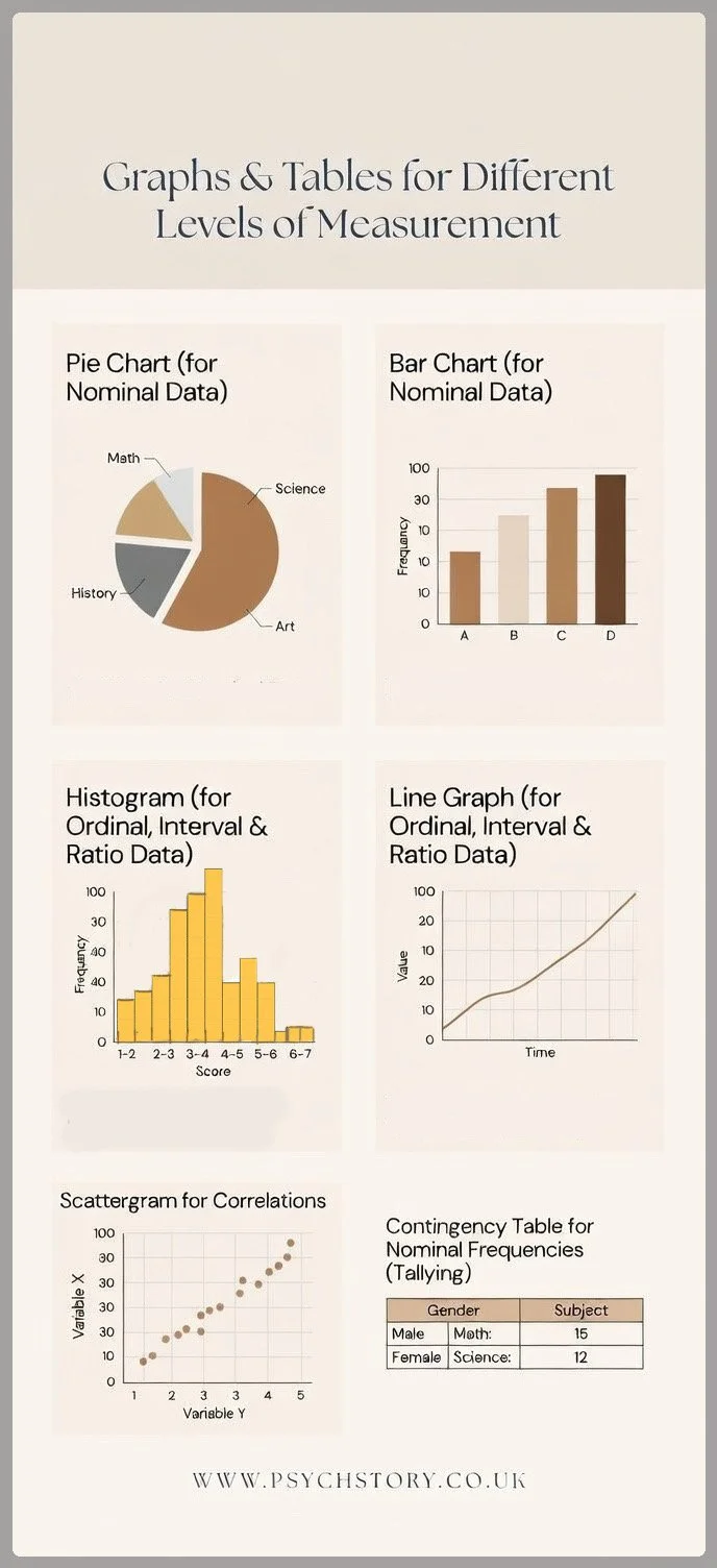
APPROPRIATE VISUALISATIONS Nominal data is best represented using bar charts or pie charts. Bar charts display the frequency of each separate category without implying any order or continuity. Pie charts show the proportion of responses in each category as parts of a whole. Graphs that assume a continuous scale, such as histograms or line graphs, are not suitable because they imply ordered, measurable progression between values.
DO PEOPLE STEREOTYPE FEMALES BY THEIR HAIR COLOUR?
HOW TO RECOGNISE NOMINAL DATA
To determine the level of measurement (nominal, ordinal, interval, or ratio), ask the following two questions:
Are the gaps/differences between the categories mathematically equal and meaningful? (In other words: Are the intervals objective, consistent, and arithmetic — or are they subjective/arbitrary?)
Can the values be meaningfully ordered from smallest to largest? (Is there a clear, natural ranking?)
To determine whether data is nominal, researchers examine the nature of the response categories. The critical feature is that the categories represent separate labels with no meaningful order and no mathematically equal or interpretable gaps between them.
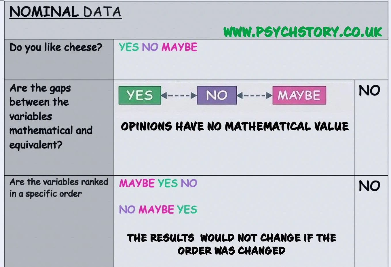
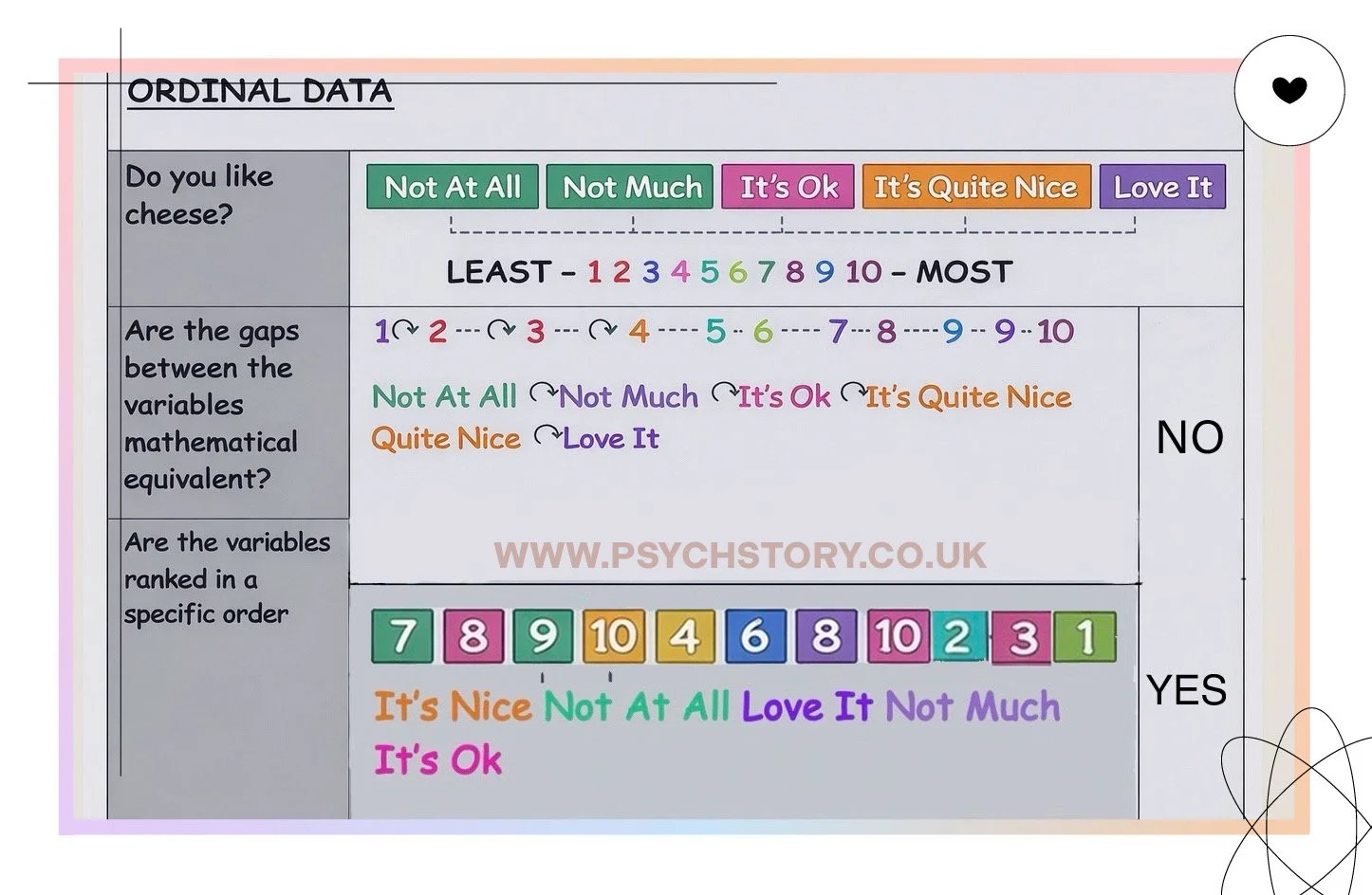
AN EXAMPLE ABOUT CHEESE
Consider the following survey question:
Q: Do you like cheese?
YES
NO
MAYBE
One participant selects “Maybe”, another selects “Yes”, and a third selects “No”.
These answers clearly fall into different categories. There is no logical way to arrange them from highest to lowest. Changing the order of the options (for example, listing them as Maybe, No, Yes) would not change the meaning of the responses. “Maybe” is not higher or lower than “Yes”.
Furthermore, there is no consistent or mathematically meaningful gap between the categories. The difference between “Yes” and “No” is not equal to, or comparable with, the difference between “No” and “Maybe” in any arithmetic sense. The response choices simply represent different types of answers a person can select.
HOW RESEARCHERS SCORE NOMINAL DATA
Researchers do not “score” nominal data in the numerical sense used for ordinal, interval, or ratio data. Instead, they simply assign each response to its appropriate category and count the frequency of each category. For example, they might record that 45 participants said “Yes”, 30 said “No”, and 25 said “Maybe”. No arithmetic operations (such as addition or averaging) are applied to the categories themselves.
This is what defines nominal data. The term “nominal” comes from the Latin word nomen, meaning “name”. Nominal data organises information into categories that function as labels or names. These categories describe different types of responses, but they do not represent quantities and cannot be arranged in a progressive sequence or hierarchy.
FURTHER CLARIFICATION
A fundamental example is the simple dichotomy of “Yes” and “No”. These represent two distinct categories, yet there is no meaningful way to rank them from highest to lowest, and there is no measurable difference between them. They simply indicate which category has been selected.
Nominal data, therefore, represents the most basic level of measurement in statistics. It allows observations to be grouped into categories and counted, but it does not allow ordering or meaningful mathematical comparison between the categories.
CODING NOMINAL DATA
Sometimes numbers are assigned to nominal categories purely for convenience when organising data. For example, when collecting information about family pets, the categories might be coded as:
1 = Dog 2 = Cat 3 = Rabbit
These numbers do not represent quantities. They serve only as labels. Assigning the number 3 to rabbits does not imply that rabbits are greater than dogs or cats, nor does it create any mathematical difference between the categories. The numbers simply identify different categories and carry no mathematical meaning.
KEY TAKEAWAY
Nominal data classify responses into distinct groups with no inherent order and no mathematically meaningful gaps between them. It identifies type rather than amount, degree, or difference, making it the most basic level of measurement
.
NOMINAL DATA TYPE QUESTIONS:
Please circle any reason from below that encouraged you to take drugs
PEER-PRESSURE STRESS COPIED-SOMEONE-YOU-ADMIRED BOREDOM TO-LOSE-WEIGHT TO-LOOK-COOL OTHER
Do you like cheese? YES NO MAYBE
MEAL PREFERENCE:
EGG-SANDWICH CHICKEN-SOUP GREEK-SALAD
RELIGIOUS PREFERENCE:
1 = BUDDHIST, 2 = MUSLIM, 3 = CHRISTIAN, 4 = JEWISH, 5 = OTHER, 6= ATHEIST, 7 = AGNOSTIC
POLITICAL ORIENTATION:
LEFT-WING, COMMUNIST, TORY, FASCIST, DEMOCRATIC, REPUBLICAN, LIBERTARIAN, GREEN
EXAMPLES OF NOMINAL DATA
ADVERTISING IN LONELY HEART ADS: How often do females versus males highlight looks or status in their advertisements? This involves categorising ads by content focus without implying any hierarchy among the focuses.

RELATIONSHIP STATUS” Relationship status options: single, married, cohabiting, divorced
ATTACHMENT STYLE: Attachment styles: secure, avoidant, ambivalent, disorganised.
PERSONALITY TYPE: Personality types, emotional stability, ambivert, extrovert, introvert, and neurotic,
COLLECTING NOMINAL DATA IN PSYCHOLOGY: Psychologists collect nominal data by categorising information without implying hierarchy or quantitative value. This involves using surveys or questionnaires with predefined options to gather information on topics such as learning styles, demographic details (e.g., gender or ethnicity), and specific behaviours or traits. For example, a survey might ask participants to select their preferred learning style from visual, auditory, or kinesthetic options, each representing a distinct category with no inherent order. This method allows researchers to effectively identify and analyse different groups or characteristics within their studies.
NOMINAL DATA SUMMARY
SIMPLICITY: Nominal data are simple because they place observations into clearly defined categories. Each response belongs to one category only, and the researcher's task is simply to record which category was chosen. The data can therefore be counted and summarised easily. For example, if asking about preferred pets, responses can be placed into categories such as dogs, cats, or guinea pigs. The analysis then focuses on how many responses fall into each category.
CATEGORISATION AND FREQUENCY: Nominal data is primarily concerned with categorisation and frequency. The purpose of collecting the data is to determine how often each category occurs. For example, when asking a question such as “Do you like cheese?” with the response choices yes, no, or maybe, the analysis focuses on how many people selected each option. The data, therefore, tells us about the distribution of responses across categories rather than any numerical relationship between them.
QUESTION FORMAT: Questions designed to collect nominal data are typically closed-ended. The response choices are provided in advance, and participants select the option that applies. Because the response options are fixed, the data can be easily grouped and counted. Although the responses are categorical, the resulting data are still quantitative because they involve counting the number of observations in each category.
DESCRIPTIVE STATISTICS": Analysis of nominal data is limited to simple descriptive statistics. Frequency counts show how many observations fall into each category, and the mode identifies the most common category. Other measures of central tendency, such as the mean or median, cannot be used because nominal data do not involve numerical measurement or ranking. Graphical representation also reflects this categorical structure. Bar charts and pie charts are typically used because they display the frequency of separate categories. The gaps between the bars in a bar chart visually indicate that the categories are distinct and not part of a continuous numerical scale. Nominal data is therefore valuable because it allows complex information to be organised into clear categories, and patterns of responses can be identified through counting and comparison
INFERENTIAL STATISTICS: Because nominal data consists of categories rather than measurable numerical values, parametric tests cannot be used. Parametric tests require interval or ratio data where the distances between values are meaningful and mathematically comparable. Instead, nominal data is analysed using non-parametric tests that work with frequencies and category counts. These tests examine whether the distribution of responses across categories differs significantly from what would be expected by chance.
ORDINAL DATA
ORDINAL LEVEL IN BRIEF
DESCRIPTION
Ordinal data introduces order or ranking, but the distances between ranks are unknown or unequal.
A relatable example is ranking their use of social media platforms. A student might rank their preferences from 1 to 10. This ranking shows how much social media is like.
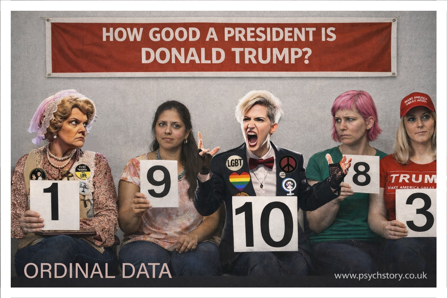
CONCRETE ILLUSTRATION OF ORDINAL DATA USING ATTRACTIVENESS RATINGS
A clear way to understand ordinal data is through the following structured example. Participants are shown a photograph of a well-known actor, such as Sydney Sweeney, and are asked to rate how attractive they think she is on a scale from 1 to 10. Each participant selects a number where 1 represents very unattractive and 10 represents very attractive. This produces ordinal data because the responses can be placed in a clear order, but the distances between the values are not equal or meaningfully measurable.
THE PRESENCE OF ORDER Ordinal data has direction and ranking. A rating of 8 is clearly higher than a rating of 6, and a rating of 10 is higher than a rating of 9. This distinguishes ordinal data from nominal data, where no order exists. However, the numbers do not represent fixed units of measurement. The scale only tells us the position of a response relative to others, not the size of the difference between them.
THE PROBLEM WITH INTERVALS If one participant gives a rating of 9 and another gives a rating of 7, we know the first participant judged the actor to be more attractive. What we cannot determine is how much more attractive. The difference between 7 and 9 is not a standardised or consistent gap. The intervals between numbers are not uniform. The jump from 8 to 9 may feel small to one person and large to another. Each participant applies their own subjective internal standard when using the scale. One person’s rating of 8 may reflect very high attractiveness, while another person’s rating of 8 may reflect only moderate attractiveness. Because the spacing is inconsistent, the data cannot be treated as having equal intervals. When a participant assigns a rating, they are not measuring attractiveness quantitatively — they are simply placing their subjective judgement into an ordered category. The numbers act as labels for rank positions rather than true units of measurement.
HOW ORDINAL DATA IS ANALYSED Ordinal data can be analysed using measures that respect order but do not assume equal spacing:
The median is appropriate because it identifies the middle value in a ranked list.
The mode is also suitable, as it shows the most frequently selected rating.
The mean, however, is problematic. Although it is sometimes calculated in practice, it assumes equal intervals between values, which ordinal data does not have. Adding ratings and dividing by the number of responses treats the numbers as consistent units, which can give a misleading impression of precision. Measures of dispersion, such as standard deviation, should be used with caution because they rely on meaningful distances between values. Simpler options, such as the range (highest minus lowest rating), are often more appropriate.
APPROPRIATE VISUALISATIONS Ordinal data is commonly displayed using bar charts to show the frequency of each rating. Line graphs may sometimes be used when the ordered nature of the data needs to be emphasised. In both cases, the graph should reflect ranking without implying equal spacing between categories.
KEY TAKEAWAY Ordinal data provides information about order and relative position. It allows us to say that one response is “more” or “less” than another, but it does not tell us by how much. The scale offers ranking without precise measurement
HOW TO RECOGNISE ORDINAL DATA
To determine whether data is ordinal, researchers ask two important questions:
Can the values be meaningfully ordered from smallest to largest? (Is there a clear, natural ranking?)
Are the gaps or differences between the ranks mathematically equal and consistent, or are they subjective and unequal?
If the answers can be ranked, but the distances between ranks are not equal or precisely measurable, the data is ordinal.
SUBJECTIVITY AND UNEQUAL GAPS
The defining characteristic of ordinal data is that while a clear order exists, the intervals between ranks are imprecise and subjective. Different people interpret the same point on a scale in very different ways.
Consider this question:
How much do you like Johnny Depp? Least — 1 — 2 — 3 — 4 — 5 — 6 — 7 — 8 — 9 — 10 — Most
One participant rates him a 10, while another rates him a 5. The 5-point difference looks precise, but it is not. For the person who gave a 10, the rating might mean casual enjoyment of a few films. For the person who gave a 5, it might reflect strong admiration after watching many movies. The “gap” between 5 and 10 does not represent the same amount of liking for both participants. The scale only shows relative order (higher or lower), not how much higher.
The same principle applies to any subjective rating, such as:
How much do you like cheese? Least — 1 — 2 — 3 — 4 — 5 — 6 — 7 — 8 — 9 — 10 — Most
A rating of 6 is clearly higher than a rating of 3, but the actual difference in preference is subjective. One person’s 6 might mean they enjoy cheese occasionally, while another’s 6 might mean they eat it regularly. The intervals are not equal or objectively measurable.
KEY TAKEAWAY
Ordinal data has a clear ranking, which distinguishes it from nominal data. However, because the gaps between ranks are subjective and unequal, researchers cannot treat the numbers as precise measurements. This is why only certain statistics (such as the median and mode) are appropriate for ordinal data, while the mean and standard deviation are usually avoided
ORDINAL DATA TYPE QUESTIONS:
Q1: Do you like cheese? NOT AT ALL, NOT MUCH, IT’S OK, IT’S QUITE NICE. I LOVE IT
Or number scales
Q2: Do you like cheese? LEAST -1 2 3 4 5 6 7 8 9 10 - MOST
Q3: Why did you start smoking? Please circle the number below.
PEER-PRESSURE : LEAST -1 2 3 4 5 6 7 8 9 10 - MOST
STRESS : LEAST -1 2 3 4 5 6 7 8 9 10 - MOST
COPIED-SOMEONE-YOU-ADMIRED : LEAST -1 2 3 4 5 6 7 8 9 10 - MOST
BOREDOM : LEAST -1 2 3 4 5 6 7 8 9 10 - MOST
TO-LOSE-WEIGHT : LEAST -1 2 3 4 5 6 7 8 9 10 - MOST
TO-LOOK-COOL : LEAST -1 2 3 4 5 6 7 8 9 10 - MOST
Q4: How much do you like Italian food? : NOT AT ALL, NOT MUCH, IT’S OK, IT’S QUITE NICE. I LOVE IT
Q5: How much do you like Thai food? Please circle a response below: LEAST -1 2 3 4 5 6 7 8 9 10 - MOST
TYPES OF ORDINAL SCALES
Ordinal data organises responses into a ranked order or hierarchy, but the exact distance or difference between ranks is usually unknown and not necessarily equal. Below are the main types of ordinal scales commonly used in psychology and social research.
LIKERT SCALES Likert scales are one of the most widely used ordinal scales in surveys. Respondents indicate their level of agreement, frequency, or intensity on a statement. A typical example is:
“To what extent do you feel stressed?”
Not at all
Slightly
Moderately
Very
Extremely
The responses create a clear order (from low to high stress), but the psychological distance between “Slightly” and “Moderately” may not be the same as between “Moderately” and “Very”.
CLINICAL ASSESSMENT SCALES In mental health and clinical settings, symptoms are often rated using ordered categories. For example, the severity of depression or anxiety may be classified as:
None
Mild
Moderate
Severe
These scales allow clinicians to rank symptom intensity while acknowledging that the intervals between levels are not precisely equal.
RANKING SCALE Participants are asked to rank items in order of preference or importance. In mating preference studies, for instance, individuals might rank traits such as “physical attractiveness”, “kindness”, and “financial stability” from most important to least important. The result is purely ordinal — first choice, second choice, third choice — with no information about how much more important one trait is than another.
SEMANTIC DIFFERENTIAL SCALES This scale measures attitudes using pairs of opposing adjectives (bipolar scales). Respondents rate a concept on a continuum between two extremes, for example:
Good ———— Bad Happy ———— Sad Strong ———— Weak
Although numbers may be assigned underneath (e.g., 1 to 7), the data remains ordinal because the psychological distance between points is not guaranteed to be equal.
GUTTMAN SCALES, also known as scalogram analysis, present statements of increasing intensity or difficulty. The key assumption is that if a person agrees with a more extreme statement, they will also agree with all milder statements below it. This creates a strict hierarchical order and allows researchers to measure the intensity of an attitude or belief.
STAPEL SCALES Stapel scales ask respondents to rate how well a single adjective describes a subject using a numerical range, typically from -5 to +5, with no neutral zero point. For example:
Innovative +5 +4 +3 +2 +1 0 -1 -2 -3 -4 -5
The scale produces ordered data, but the intervals are not equal, and the absence of a true neutral point distinguishes it from many Likert-type formats.
ORDINAL DATA SUMMARY
Numbers in ordinal data merely signify a sequence rather than a quantitative value.
ORDINAL DATA SUMMARY: In ordinal data, numbers are used only to indicate order or rank. They do not represent equal distances or true quantitative values. A rating of 8 is known to be higher than a rating of 6, but it is impossible to say exactly by how much.
THE ROLE OF ORDINAL DATA: Ordinal data lies between nominal and interval/ratio data. Nominal data simply places responses into unordered categories with no ranking. Interval and ratio data allow precise measurement with equal intervals. Ordinal data occupies the middle ground by arranging responses into a meaningful hierarchy. It is especially useful in psychology for measuring subjective experiences such as preferences, opinions, attitudes, and levels of intensity, where exact differences cannot be measured but a clear order can still be established.
HOW ORDINAL DATA IS COLLECTED: Ordinal data is typically gathered through surveys and questionnaires using closed-ended questions. Respondents choose from a set of ordered options that reflect increasing or decreasing levels of an attribute. Common examples include scales ranging from “strongly disagree” to “strongly agree”, from “not at all” to “extremely”, or from “poor” to “excellent”. In every case, the responses form a ranked sequence, yet the psychological distance between adjacent points on the scale is not necessarily the same.
ANALYSING ORDINAL DATA: Because the intervals between ranks are unequal and not precisely measurable, the analysis of ordinal data requires care. Researchers can use frequency distributions and percentages to summarise the responses. The mode identifies the most common answer, while the median is the middle value when the responses are ordered. The range or interquartile range can describe the spread of the data without assuming equal spacing. However, the mean and standard deviation are generally inappropriate. These measures assume equal intervals between values, an assumption that ordinal data does not support. Using them can give a misleading impression of precision.
KEY TAKEAWAY: Ordinal data provides valuable information about relative order and ranking. It allows researchers to make statements such as “more than” or “less than”, but it does not permit precise claims about “how much” difference exists between ranks. This balance between simplicity and structure makes ordinal scales one of the most commonly used tools in psychological research
INTERVAL DATA
INTERVAL LEVEL IN BRIEF
Interval data is a level of measurement that has two important characteristics:
It is ordered (the values can be arranged from smallest to largest), and it has equal, mathematically consistent intervals between the values. This means the difference between any two points on the scale is the same, no matter where they occur. For example, the difference between 90 and 100 is exactly the same as the difference between 120 and 130. However, interval data has no true zero. The zero point is arbitrary and does not represent the complete absence of the measured quantity. Because of this, you can make meaningful comparisons of differences (such as “30 points higher”), but you cannot make meaningful ratio statements (such as “twice as much”).In simple terms, interval data allows addition and subtraction, but not multiplication or division in a meaningful way.
HOW TO RECOGNISE INTERVAL DATA
To determine whether the data is interval, researchers ask two key questions:
Can the values be meaningfully ordered from smallest to largest?
Are the gaps or differences between the values mathematically equal, consistent, and meaningful?
If the answers to both questions are yes and there is no true zero point, then the data are interval data.
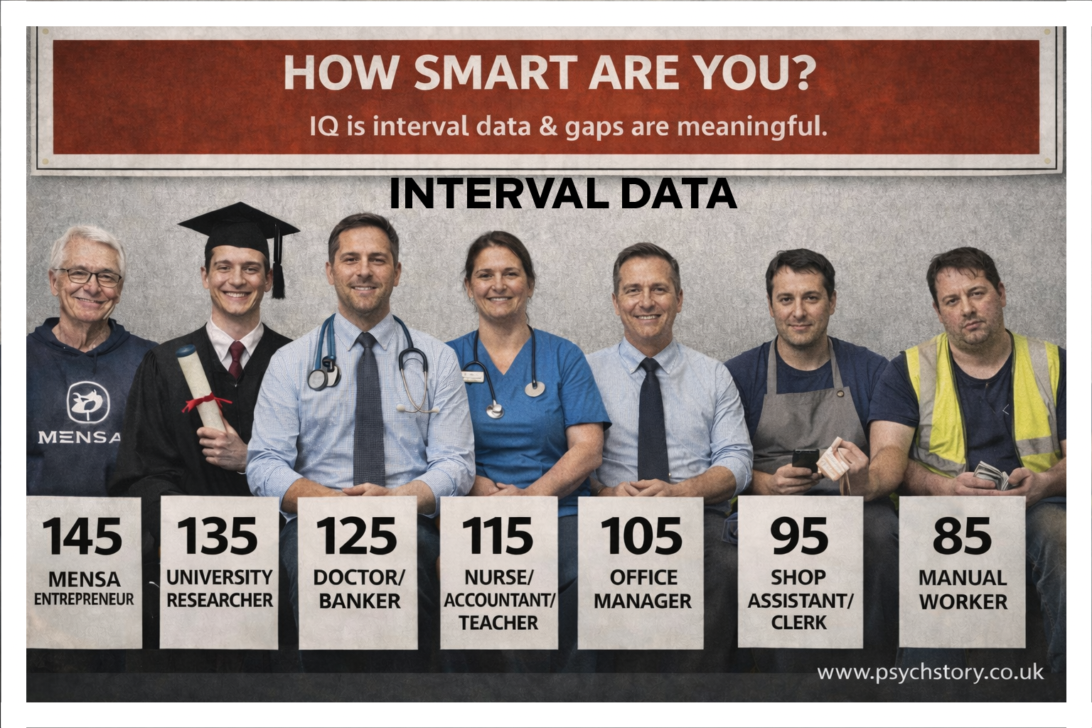
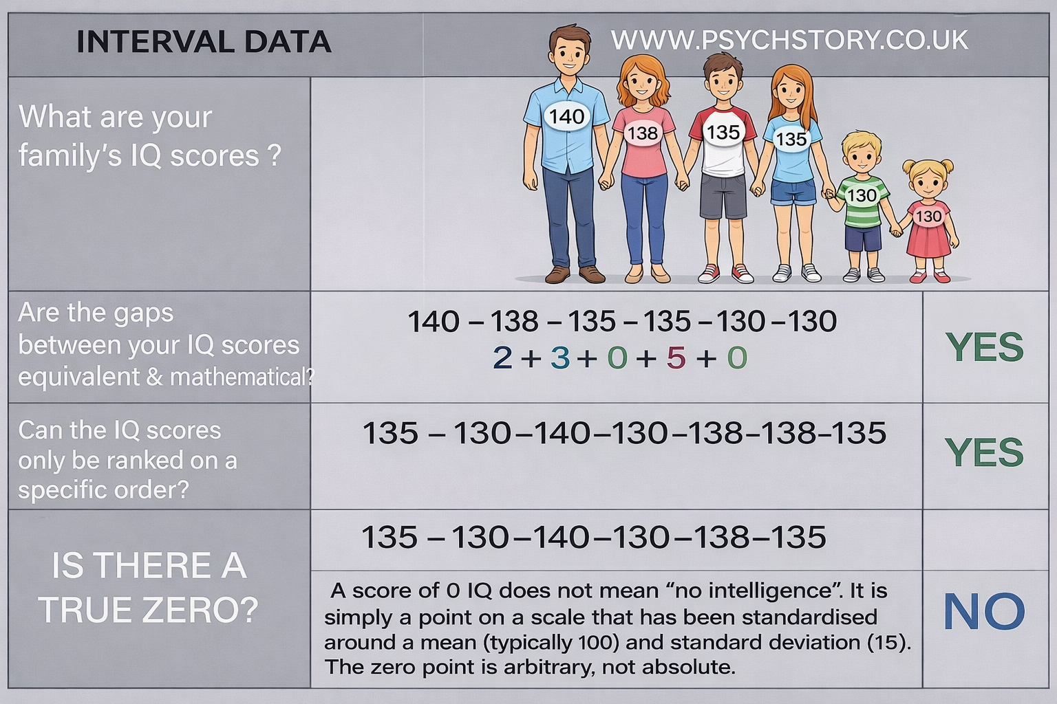
INTERVAL DATA EXAMPLE WITH IQ SCORES
Consider the following IQ scores:
Frank: 210
Blue: 180
Dolly: 150
These scores show the key feature of interval data. The gaps between them are equal and consistent: Blue is exactly 30 points higher than Dolly, and Frank is exactly 30 points higher than Blue. Because the intervals are the same everywhere on the scale, the differences between scores are meaningful and can be compared directly.
WHY THE TRUE ZERO MATTERS – AND WHY IT IS “MADE UP” IN IQ
The biggest point of confusion for students is the idea of a true zero.
A true zero means the scale starts from a real point where the thing being measured is completely absent. For example, in height (ratio data), zero centimetres means no height at all — the person would not exist. Because the zero is real, we can say someone is twice as tall as someone else, and that statement actually makes sense in the real world.
IQ is different. The zero on an IQ test is completely made up (arbitrary). The test creators simply chose zero as a convenient starting number. There is no point on the IQ scale where intelligence is truly absent. Even a person in a vegetative state has some basic brain activity, so they retain some intelligence.
The IQ scale was designed so that the average person scores around 100, and each point represents an equal step away from that average. The zero point was never meant to represent “zero intelligence.” It is just an artificial starting line.
Why can’t we say “twice as intelligent”?
Because the zero is arbitrary, the numbers on the IQ scale show only relative positions, not absolute levels of intelligence.
When Frank scores 210, and Dolly scores 150, we know Frank is 60 points higher than Dolly (two equal 30-point steps). That difference is meaningful.
However, saying Frank is “twice as intelligent” as Dolly assumes that intelligence starts from zero and can be multiplied like a real quantity (like weight or height). Since the zero on the IQ scale is artificial and does not mean “no intelligence,” doubling any score does not double the actual intelligence. The numbers are not measuring raw amounts that can be proportionally scaled.
In simple terms:
You can add and subtract on interval scales → differences work.
You cannot multiply or divide meaningfully → ratios do not work.
A CONCRETE ILLUSTRATION OF INTERVAL DATA USING IQ SCORES AND QUESTIONNAIRE TOTALS
A clear way to understand interval data is to start with a straightforward, objective example such as IQ scores.
IQ tests contain specific questions and tasks with clear, objective right-or-wrong answers. The score is based on the number of correct responses. Because the scoring is factual rather than opinion-based, each correct answer adds a precise, mathematically meaningful unit to the total. These raw scores are then standardised so that the difference between any two points on the final scale is equal and consistent. For example, the difference between an IQ of 90 and 100 is exactly the same as the difference between 120 and 130. This equal spacing across the entire range is the defining feature of interval data. Because the intervals are mathematically equal and the scoring is objective, differences between scores are genuinely meaningful. We can accurately say that a person with an IQ of 130 performed 30 points better than someone with an IQ of 100, and this gap reflects a real difference in cognitive performance.
CLASSIC EXAMPLES OF INTERVAL DATA
STANDARDISED TESTS SUCH AS IQ TESTS. These are among the clearest and most widely used examples. The scoring system is deliberately designed so that equal numerical differences reflect equal differences in underlying performance. This allows meaningful comparisons between scores. However, the scale's starting point is arbitrary. A score of zero does not represent the absence of intelligence, which is why IQ scores are classified as interval data rather than ratio data.
TEMPERATURE SCALES (CELSIUS OR FAHRENHEIT) Temperature provides one of the cleanest illustrations. The difference between 10°C and 20°C is exactly the same as the difference between 20°C and 30°C — the intervals are equal and meaningful. Yet 0°C does not mean “no temperature” at all (true absence of heat occurs at absolute zero on the Kelvin scale). This is why Celsius and Fahrenheit are interval scales, while Kelvin is a ratio scale.
PSYCHOLOGICAL RATING SCALES (OFTEN TREATED AS INTERVAL) Many psychological scales, such as those measuring mood, anxiety, pain, or satisfaction (for example, a 1–10 rating), are commonly treated as interval data in research. Researchers assume that the spacing between points is roughly equal, so the difference between 2 and 3 is similar in magnitude to the difference between 8 and 9. This assumption allows the use of parametric statistical analyses such as means and t-tests, even though the zero point remains arbitrary. Note that individual Likert-style items are sometimes debated as closer to ordinal, but summed or multi-item scales are frequently analysed as interval.
NEUROIMAGING MEASURES (E.G. FMRI BOLD SIGNAL CHANGES) Functional MRI signals usually reflect relative changes in brain activation compared with a resting baseline, rather than absolute levels of neural activity. The intervals between signal values allow meaningful comparisons of increases or decreases in activation. However, there is no true zero that represents “no brain function,” so these measures are best classified as interval data in most research contexts.
WHAT DOES NOT QUALIFY AS INTERVAL DATA (COMMON ERRORS): Reaction time, behavioural frequency counts, height, weight, and similar physical measurements are ratio data, not interval data. They possess a true zero, indicating the variable's complete absence. A reaction time of 0 milliseconds means no delay whatsoever, and 0 occurrences of a behaviour means the behaviour did not happen at all. This true zero allows meaningful ratio statements such as “twice as fast” or “twice as frequent” — statements that cannot be made with interval data.
KEY TAKEAWAY: Interval data allows you to compare differences meaningfully (addition and subtraction work) and to use equal intervals for statistical analysis. However, it does not allow you to make proportional (ratio) statements, because the zero point is arbitrary rather than a true absence of the measured attribute. Recognising this distinction helps researchers choose the right statistical tests and interpret findings correctly. Interval scales sit between purely ordered data (ordinal) and fully proportional data (ratio).
INTERVAL DATA SUMMARY
Interval data provides researchers in psychology, education, and the sciences with a valuable way to quantify and analyse variables. It brings mathematical rigour through equal intervals, while still having important limitations regarding ratio calculations and the interpretation of zero.
EQUAL AND CONSISTENT INTERVALS: Interval data is defined by equal and consistent mathematical intervals across the entire scale. The difference between any two points is objective and applies uniformly, regardless of where they fall on the scale. For example, the difference between a Global Assessment of Functioning (GAF) score of 100 and 95 is exactly the same as the difference between 95 and 90. This consistent spacing is the core strength of interval data. Common examples include IQ scores, temperature in Celsius or Fahrenheit, pulse rates, and certain memory or cognitive test scores.
THE ABSENCE OF A TRUE ZERO: What truly distinguishes interval data is its lack of a true zero. The zero point is arbitrary and does not represent the complete absence of the measured variable. In Celsius, 0°C does not mean “no temperature” — temperatures can go below zero. Likewise, a score of 0 on an IQ test does not mean “no intelligence at all.” Even a person in a vegetative state still has some level of brain function and intelligence. Because the zero is artificial, interval data support meaningful comparisons of differences (such as “10 points higher” or “5 degrees warmer”), but they do not allow ratio statements such as “twice as intelligent” or “twice as hot.”
STATISTICAL ANALYSIS AND GRAPHICAL REPRESENTATION: Because of its equal intervals, interval data support a wide range of statistical procedures. Researchers can calculate means and use standard deviation to measure variability. However, when datasets contain extreme scores or skewness, the interquartile range often provides a more accurate picture of the spread. Line graphs and histograms are particularly well-suited to interval data, as they clearly show trends and distributions while respecting the equal spacing between values.
KEY TAKEAWAY: Interval data offers numerical precision and consistent intervals, making it far more powerful than nominal or ordinal data for statistical analysis. However, because it lacks a true zero, it does not permit meaningful proportional or ratio statements. Recognising this limitation helps researchers select appropriate statistical tests and interpret their findings correctly
RATIO DATA
RATIO DATA IN BRIEF
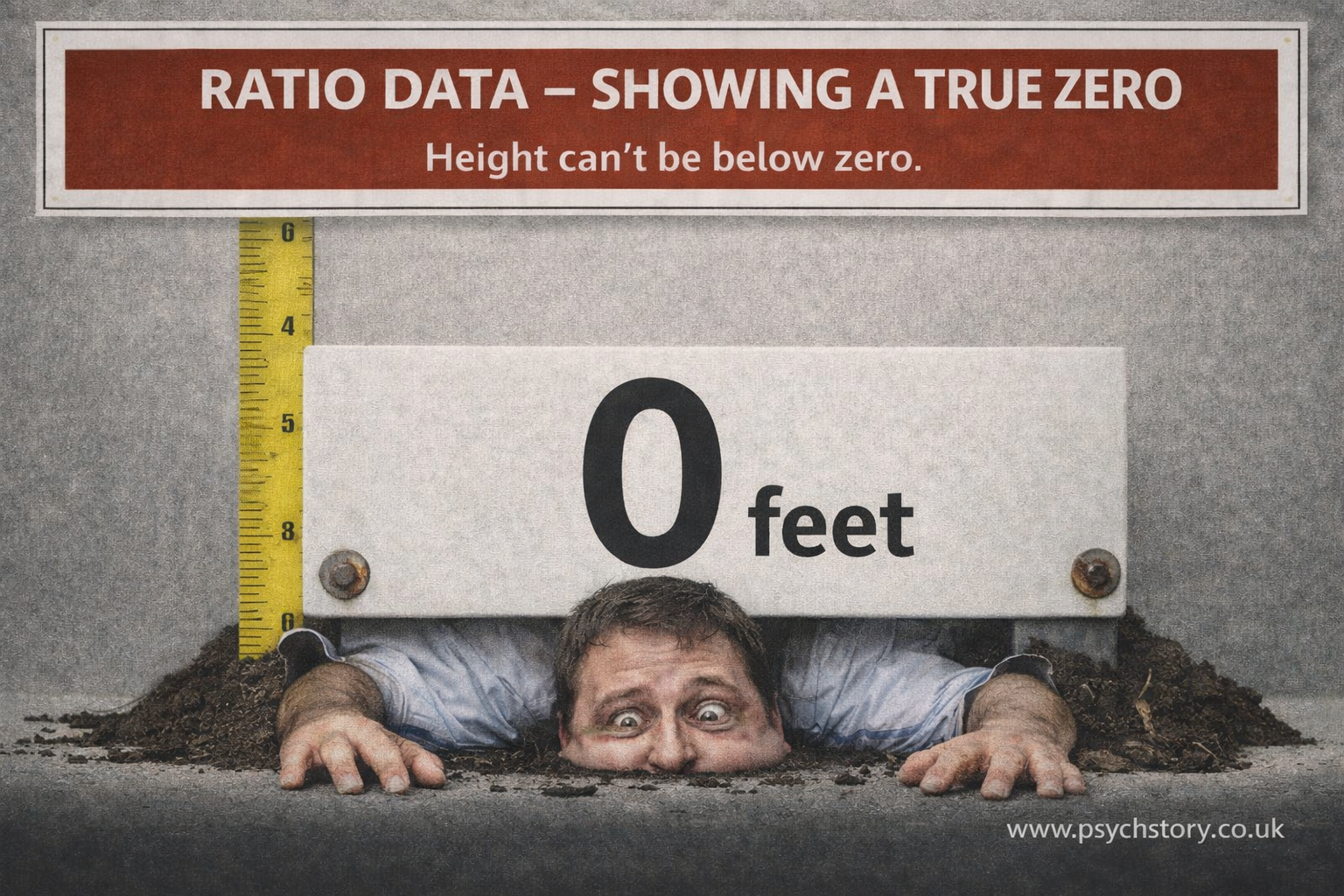
Ratio data has all the properties of interval data — order and equal, consistent intervals — plus one crucial addition: a true zero point. This true zero represents the complete absence of the quantity being measured. Because of it, ratio data allows meaningful proportional comparisons, such as “twice as much”, “half as many”, or “three times as frequent”.
A CONCRETE ILLUSTRATION OF RATIO DATA USING REACTION TIME AND HEART RATE
A clear way to understand ratio data is through direct physiological and behavioural measurements commonly used in psychology, such as reaction time and heart rate. In a typical cognitive experiment, participants may be asked to press a button as quickly as possible when a stimulus appears on a screen. Their reaction time is recorded in milliseconds. Similarly, in studies of stress or arousal, a participant’s heart rate may be measured in beats per minute using a monitor. This produces ratio data because the values are numerical, the intervals between them are equal, and there is a true zero point. A reaction time of 400 milliseconds represents the same increase from 300 milliseconds as 500 does from 400. The units are consistent, and differences between values are directly comparable. This satisfies the requirement of equal intervals, as in interval data. However, ratio data go further because zero represents the complete absence of the variable being measured. A reaction time of 0 milliseconds would mean no delay between stimulus and response. A heart rate of zero beats per minute would indicate no cardiac activity. While such values are not typically observed in practice, the scale itself has a true zero, which gives the data additional mathematical properties. Because of this true zero point, ratios between values are meaningful. It is valid to say that a reaction time of 400 milliseconds is twice as long as 200 milliseconds, or that a heart rate of 120 beats per minute is double that of 60 beats per minute. This type of comparison is not possible with interval data, where zero does not represent an absence. The presence of equal intervals and a true zero means that ratio data can be treated as fully quantitative. The mean can be calculated and interpreted meaningfully because the values can be added and averaged. For example, an average reaction time across participants provides a valid measure of central tendency. Measures of dispersion, such as range and standard deviation, are also appropriate. These statistics rely on the ability to calculate distances between values, which is possible because the units are consistent and the scale is continuous. The spread of reaction times around the mean reflects real differences in performance. More advanced statistical techniques can also be applied. Correlation coefficients, regression analyses and parametric tests all rely on the mathematical properties of ratio data. These methods allow precise examination of relationships between variables, such as the link between arousal and reaction time or between stress and heart rate. The graphical representation reflects the data's continuous, quantitative nature. Histograms and line graphs are appropriate because the data exists along a continuous scale with meaningful intervals. These graphs allow researchers to visualise distributions, trends and patterns in a way that accurately represents the underlying measurements. The key point is that ratio data provides numerical values with equal intervals and a true zero. This allows full mathematical treatment of the data, including meaningful comparisons of magnitude, making it the most precise level of measurement in psychological research
HOW TO RECOGNISE RATIO DATA
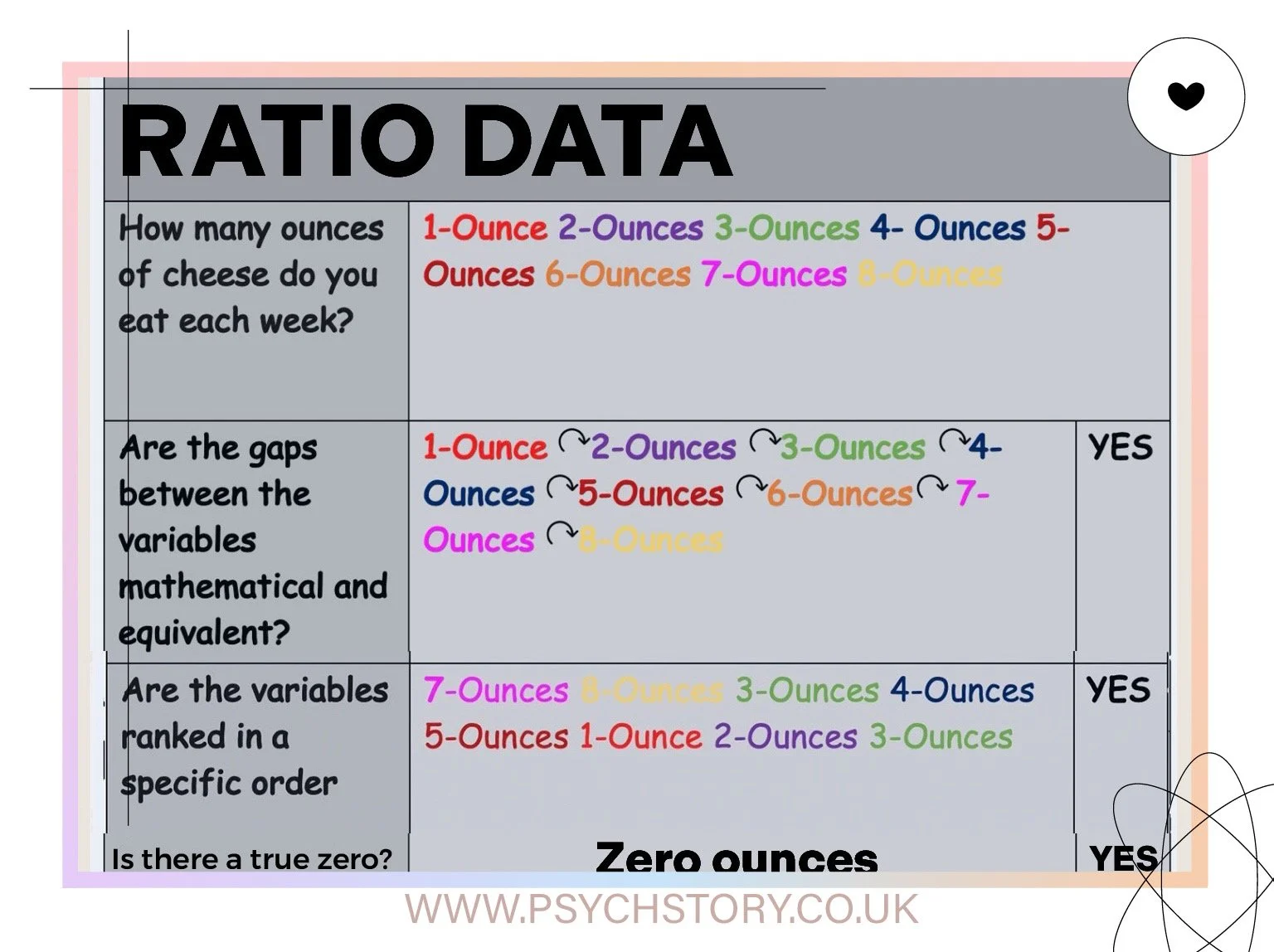
To identify ratio data, researchers ask the same two questions used for interval data, with one additional check:
Can the values be meaningfully ordered from smallest to largest?
Are the gaps or differences between the values mathematically equal and consistent?
Is there a true zero point that represents the complete absence of the variable?
If the answer to all three is yes, the data is a ratio.
THE TRUE ZERO POINT
Ratio data has equal and consistent intervals like interval data, but the presence of a true zero gives it additional mathematical power. This true zero allows meaningful multiplication and division. In contrast, interval data has an arbitrary zero, so ratios are not meaningful.
KEY EXAMPLES OF RATIO DATA
Common examples include height, weight, reaction time, distance, age, income, and frequency counts. In each case, zero has an absolute meaning. Zero height means no height at all, zero reaction time means no delay whatsoever, and zero occurrences of a behaviour means the behaviour did not happen. This allows statements such as “twice as fast”, “half as heavy”, or “three times as many”.
Note on AQA exams: AQA does not require students to distinguish between interval and ratio data in most questions. Both are generally treated as suitable for parametric tests, and the focus is usually on whether the data has equal intervals rather than on the presence of a true zer
HOW TO RECOGNISE RATIO DATA
To determine the level of measurement (nominal, ordinal, interval, or ratio), ask the following two questions:
Are the gaps/differences between the categories mathematically equal and meaningful? (In other words: Are the intervals objective, consistent, and arithmetic — or are they subjective/arbitrary?)
Can the values be meaningfully ordered from smallest to largest? (Is there a clear, natural ranking?)
THE TRUE ZERO POINT
Ratio data has all the features of interval data — equal and consistent intervals between values — plus one crucial addition: a true zero point.
This true zero represents the complete absence of the quantity being measured. Because of it, ratio data allows meaningful proportional comparisons (multiplication and division), such as “twice as much” or “half as many.”
In contrast, interval data has equal intervals but an arbitrary zero, so ratios are not meaningful.
KEY EXAMPLES OF RATIO DATA
HEIGHT Consider the heights of three individuals:
Ralphie: 5'9" (175 cm)
Frank: 5'11" (180 cm)
Blue: 6'0" (183 cm)
The intervals between these heights are equal and stable. More importantly, a height of 0 cm would mean no height at all. This true zero allows statements such as “Blue is 8 cm taller than Ralphie” and meaningful ratios (e.g., one person being 10% taller than another).
WEIGHT Zero weight means the complete non-existence of mass. This allows direct proportional comparisons — one object can meaningfully be described as twice as heavy as another.
OTHER COMMON EXAMPLES
Reaction time (0 ms = no delay at all)
Number of stress-related behaviours per day (0 = none occurred)
Distance, age, income, or frequency counts
In each case, zero has an absolute meaning, enabling statements like “twice as fast,” “half as many,” or “three times the distance.”
COLLECTING RATIO DATA IN PSYCHOLOGY
Ratio data in psychology is collected when variables have equal intervals and a true zero point that represents the complete absence of the measured quantity. This true zero allows meaningful proportional comparisons such as “twice as many” or “half as fast”.
BEHAVIOURAL OBSERVATIONS Directly counting the frequency of specific behaviours produces clear ratio data. Examples include the number of smiles, aggressive acts, or verbal responses in an observation session. A count of zero means the behaviour did not occur at all, which enables precise comparisons such as “twice as many instances”.
SELF-REPORT SURVEYS Surveys that ask for countable quantities also yield ratio data. Questions such as “How many hours per week do you exercise?” or “How many cigarettes do you smoke daily?” have a true zero (no hours or no cigarettes). Although self-reports can be biased or subject to memory error, the question structure still yields ratio-level data.
GENETIC AND BIOLOGICAL MEASURES Direct biological measures are often ratio data. Regional brain volume from structural MRI scans (measured in cm³) or counts of specific genetic markers have a true zero — zero volume, which means no tissue is present, and zero markers means complete absence. These allow meaningful proportional analysis.
NEUROIMAGING AND COGNITIVE TESTS Structural neuroimaging produces ratio data because brain volume has a genuine zero point. In cognitive tasks, the number of correct responses and reaction time (where 0 ms indicates no delay) are also ratio measures.
EXPERIMENTAL TASKS In conditioning, learning, or performance experiments, researchers often record response rates or frequencies. Zero responses mean no activity occurred, which allows clear proportional statements such as “twice the response rate”.
RATIO DATA SUMMARY
RATIO DATA VERSUS INTERVAL DATA
The fundamental distinction between ratio and interval data lies in the use of a zero point. Ratio data include a true zero that represents the complete absence of the variable, so they support both differences and meaningful ratios (e.g., “twice as much” or “half as many”). Interval data has an arbitrary zero, so it supports differences but not ratios.
EXAMPLES OF THE DISTINCTION
Anxiety rating (0–10): Even if someone rates their anxiety as 0, it may not mean a complete absence of anxiety. Saying a rating of 4 is “twice” a rating of 2 is misleading. This scale is typically treated as interval data.
Temperature in Celsius: 0°C does not mean “no temperature” (values can go below zero). You cannot say 20°C is twice as hot as 10°C.
Mood scale (-5 to +5): 0 represents neutral mood, not the absence of mood. A score of +4 is not “twice as happy” as +2.
PRACTICAL APPLICATIONS
Ratio data supports the full range of statistical analyses, including all measures of central tendency (mean, median, mode), measures of dispersion (standard deviation, variance, range), and proportional calculations. It can be clearly displayed using histograms, line graphs, or bar charts that include the true zero point for accurate interpretation.
Ratio data is commonly collected in psychology through both direct physical measurements (e.g., height, weight, brain volume) and counts (e.g., number of behaviours, errors, or items recalled).
KEY CONSIDERATION WHEN IDENTIFYING LEVELS OF MEASUREMENT
A persistent source of confusion in research methods is the tendency to classify data based on how it looks at the end of the process, rather than on what was actually measured when the participant gave their response. This confusion is amplified in psychology because responses are frequently converted into numbers for scoring and statistical analysis. Once numbers appear, there is a strong but misleading assumption that the data must therefore be interval or ratio. This assumption is incorrect. The presence of numbers does not determine the level of measurement. The level of measurement is determined by the nature of the response the participant was required to provide. To establish this clearly, it is necessary to separate two stages in the research process:
WHAT THE PARTICIPANT DOES WHEN RESPONDING
WHAT THE RESEARCHER DOES WHEN ANALYSESING THE DATA
These two stages are often collapsed into one, which is where the misunderstanding begins. At the point of response, the participant is engaging with a specific type of task. If they are asked to choose between categories with no order, such as yes or no, or male or female, then the data is nominal. If they are asked to choose from an ordered set of categories, such as never, rarely, sometimes, often, always, or a numerical scale such as 1 to 5 representing increasing intensity, then the data is ordinal. If they are asked to produce a direct numerical value, such as their height, reaction time, or hormone level, then the data are ratios. This classification is grounded in what the participant is actually doing. It reflects the structure of the response itself, not how the researcher later manipulates the data.
The complication arises when multiple responses are combined. In many psychological measures, including questionnaires such as the Body Shape Questionnaire, participants respond to a series of items using an ordinal scale. Each individual response remains ordinal. However, researchers then sum these responses to produce a total score. At this stage, the data takes on a different appearance. A participant might now have a score of 59 or 90. This looks numerical and can give the impression of precision, as though the difference between 59 and 60 represents a consistent, measurable unit. However, this impression is constructed by the scoring process, not by the original responses. The participant did not generate a continuous measurement. They selected from a set of ordered categories. The numbers assigned to those categories are labels that allow the researcher to quantify and combine responses, but they do not transform the underlying data into true interval or ratio measurements.
In more advanced statistical and psychometric contexts, it is sometimes argued that when many ordinal items are combined, the resulting total score can approximate an interval scale. This is based on the idea that multiple items may smooth out irregularities in spacing between categories and produce a distribution that behaves as if the intervals were equal. However, this is an assumption used for analytical convenience, not a literal transformation of the data into a true interval scale. This distinction is critical. The level of measurement is not determined by the final numerical score. It is determined by the structure of the responses at the point they are given. The researcher’s decision to add, average, or statistically manipulate those responses does not retroactively change the nature of the original data.
CRITICAL DISTINCTION
The level of measurement depends on what is recorded at the point of data collection.
If the data records are categorised, the data are nominal.
If it records ordered positions, it is ordinal.
If it records equal intervals, it is an interval.
If it includes a true zero, it is a ratio.
Reclassifying or grouping data later does not change its original level of measurement.
AQA APPROACH TO LEVELS OF MEASUREMENT
Within the AQA specification, the emphasis is deliberately placed on clarity and consistency. Students are expected to classify data based on what is being measured at the point of response, not on how the data might later be analysed or interpreted in more advanced statistical frameworks. This means that the correct approach in an exam context is to ignore the final score and focus entirely on the response format presented to the participant.
If a participant is selecting between categories with no inherent order, the data is nominal.
If a participant selects from an ordered scale, the data are ordinal.
If a participant provides a direct numerical measurement with equal units and a true zero, the data are ratio data.
Questionnaires such as the Body Shape Questionnaire are therefore classified as ordinal in AQA answers, even though the responses are often summed to produce a total score. The summation process does not alter the level of measurement that the student is expected to identify.
AQA does not require students to engage with the more complex argument that aggregated ordinal data can be treated as interval under certain statistical assumptions. Introducing that argument in an exam answer risks overcomplication and, more importantly, risks misclassifying the data according to the mark scheme.
The most reliable method is therefore procedural:
Identify what the participant was asked to do.
Identify the structure of the response options.
Classify the data based on that structure.
This approach aligns with how exam questions are constructed and how marks are awarded. It avoids the common error of being misled by numerical scores and ensures that the classification reflects the actual measurement process rather than the appearance of the final data
LEVELS OF MEASUREMENT USED IN PSYCHOLOGICAL RESEARCH
The level of measurement is determined by how the data is collected, not how it is later grouped or interpreted. The same test can produce different types of data depending on what is recorded. Classification after the fact does not change the level of measurement.
NOMINAL DATA – TESTS AND EXAMPLES (CATEGORISATION ONLY)
DSM / ICD DIAGNOSES
Data is collected as categories based on symptom criteria.
A person either meets the criteria for depression, OCD, schizophrenia, etc., or they do not.
No ordering and no quantity is measured.STRANGE SITUATION (ATTACHMENT TYPES)
Behaviour is observed, and infants are placed into categories such as secure or insecure.
The data collected is the type of attachment, not a score of “how much” attachment.MBTI (MYERS-BRIGGS TYPE INDICATOR)
Produces personality types such as INTJ or ENFP.
These are categories of preference, not measurements.EYSENCK PERSONALITY INVENTORY (WHEN USED AS TYPE CLASSIFICATION)
If individuals are grouped into types such as introverts or extraverts, the data are nominal.
The classification is categorical.ZODIAC SIGNS (TEACHING EXAMPLE)
Assigned using date of birth, which involves numerical calculation.
However, the recorded data is in the category (Aries, Taurus, etc.).
The categories are distinct and unordered.
This shows that the method of assignment can involve numbers, but the resulting data can still be nominal.SALLY-ANNE TASK (PASS / FAIL)
The data collected is whether the child passed or failed.
This is categorical, not a measure of degree.KEY POINT
Nominal data records the category to which something belongs.
It does not measure how much of something is present.
ORDINAL DATA – TESTS AND EXAMPLES (RANKING WITHOUT EQUAL INTERVALS)
GLOBAL ASSESSMENT OF FUNCTIONING (GAF)
Individuals are placed along a scale from severe impairment to high functioning.
There is an order, but the gaps between scores are not equal.EATING ATTITUDES TEST / FASCISM SCALE (LIKERT FORMAT)
Responses such as strongly agree to strongly disagree.
These can be ranked, but the point difference is not consistent.BODY SHAPE QUESTIONNAIRE
Produces levels of concern about body image.
Indicates more or less concern, but not precise differences.DRIVING TEST OUTCOMES
Pass, minor faults, major faults.
Ordered in terms of performance, but not equally spaced.GCSE GRADES (WHEN USED AS RANKS)
Higher grades indicate better performance, but differences are not uniform.
INTERVAL DATA – TESTS AND EXAMPLES (EQUAL INTERVALS, NO TRUE ZERO)
IQ TESTS / WAIS
Scores have equal intervals.
The difference between 100 and 110 is the same as between 110 and 120.
There is no true zero, so ratios are not meaningful.MMPI
Produces standardised scores across personality dimensions.
Differences between scores are interpretable as equal.GAD-7
Produces a summed score treated as an interval.
Equal differences between scores are assumed for analysis.A LEVELS / GCSE NUMERICAL SCORES (WHEN TREATED AS SCALED DATA)
Differences between marks are treated as equal, but there is no true zero of ability.
RATIO DATA – TESTS AND EXAMPLES (TRUE ZERO AND FULL MEASUREMENT)
REACTION TIME (E.G. MARSHMALLOW TEST, COGNITIVE TASKS)
Measured in seconds or milliseconds.
Has a true zero and equal intervals.PHYSIOLOGICAL MEASURES (HEART RATE, SKIN CONDUCTANCE)
True zero exists.
Ratios are meaningful.NUMBER OF BEHAVIOURS OR RESPONSES
Count data with a true zero.
Allows full mathematical operations.
VALIDITY AND RELIABILITY OF DIFFERENT LEVELS OF MEASUREMENT
VALIDITY AND RELIABILITY OF DIFFERENT LEVELS OF MEASUREMENT
The level of measurement matters for reliability and validity because some types of data are precise measurements, while others rely on opinions and feelings. The more subjective the data, the more room there is for disagreement and interpretation, which reduces reliability and can weaken validity. As data becomes more objectively measured, both reliability and validity generally increase.
NOMINAL
Nominal data simply place observations into categories.
Reliability can be weak because the classification often depends on human judgment. Two researchers observing the same behaviour might not classify it the same way. For example, one observer might label behaviour as aggressive while another might interpret it as playful or competitive. Because the decision depends on interpretation, the same observation may not always be classified consistently.
Validity can also be limited because nominal categories often simplify complex phenomena. A category such as “has depression” versus “does not have depression” does not capture severity or variation in symptoms.
ORDINAL
Ordinal data introduces ranking, but the distances between ranks are unknown.
Reliability can still be problematic because people interpret ranking scales differently. If students rate their stress from 1 to 10, a rating of 7 may represent very different levels of stress for different individuals.
Validity is also limited because the numerical differences between ranks are not meaningful measurements. The gap between ratings of five and six may not represent the same difference as the gap between eight and nine.
INTERVAL
Interval data contains ordered values with equal distances between them.
Reliability improves because the measurement is standardised. Temperature measured with the same thermometer should produce the same result when measured repeatedly under the same conditions.
Validity is also stronger when the measurement corresponds closely to the phenomenon being measured. Temperature readings reflect actual thermal conditions. However, interval scales lack a true zero, so ratios cannot be interpreted meaningfully.
RATIO
Ratio data contains all the properties of interval data but also includes a true zero point.
Reliability is typically very high because the measurements are objective and replicable. Measuring someone’s height or reaction time will produce consistent results across different observers using the same instruments.
Validity is also strongest because the measurement directly reflects the quantity being studied and allows meaningful comparisons, such as one value being twice as large as another.
As the level of measurement increases from nominal to ratio, the precision of the data increases. This reduces reliance on interpretation and increases both the reliability and the validity of the measurement.
Make it stand out
Whatever it is, the way you tell your story online can make all the difference.